Plotting #1: Analysis Plots
Compiled: May 11, 2026
Source:vignettes/articles/Gene_Expression_Plotting.Rmd
Gene_Expression_Plotting.RmdCustomizing Plots for Enhanced/Simplified Visualization
While the default plots from Seurat and other packages are often very good they are often modified from their original outputs after plotting. scCustomize seeks to simplify this process and enhance some of the default visualizations.
Even simple things like adding the same two ggplot2 themeing options to every plot can be simplified for end user (and enhance reproducibility and code errors) by wrapping them inside a new function.
For this tutorial, I will be utilizing microglia data from Marsh et
al., 2022 (Nature
Neuroscience) the mouse microglia (Figure 1) referred to as
marsh_mouse_micro and the human post-mortem snRNA-seq
(Figure 3) referred to as marsh_human_pm in addition to the
pbmc3k dataset from SeuratData package.
library(ggplot2)
library(dplyr)
library(magrittr)
library(patchwork)
library(viridis)
library(Seurat)
library(scCustomize)
library(qs2)

# Load Marsh et al., 2022 datasets
marsh_mouse_micro <- qs_read(file = "assets/marsh_2020_micro.qs2")
marsh_human_pm <- qs_read(file = "assets/marsh_human_pm.qs2")

# Load pbmc dataset
pbmc <- pbmc3k.SeuratData::pbmc3k.final
We’ll add some random meta data variables to pbmc data form use in this vignette
pbmc$sample_id <- sample(c("sample1", "sample2", "sample3", "sample4", "sample5", "sample6"), size = ncol(pbmc),
    replace = TRUE)
pbmc$treatment <- sample(c("Treatment1", "Treatment2", "Treatment3", "Treatment4"), size = ncol(pbmc),
    replace = TRUE)
General Notes
- Parameter names
- Customized plots that take their origin from Seurat share many
direct parameter names from their Seurat equivalents (i.e.,
split.by) but some others use the scCustomize convention so as to be universal throughout the package (i.e., Seurat=cols:scCustomize=colors_use). - Many of the most used parameters for Seurat-based functions have implemented as direct parameter in scCustomize versions allowing for easy tab-completion when calling functions.
- However, for simplicity of function calls this is not comprehensive.
However, most scCustomize plotting functions contain
...parameter to allow user to supply any of the parameters for the original Seurat (or other package) function that is being used under the hood.
- Customized plots that take their origin from Seurat share many
direct parameter names from their Seurat equivalents (i.e.,
- ggplot2/patchwork Modifications
- All scCustomize plotting functions return either ggplot2 or
patchwork objects allowing for easy additional plot/theme modifications
using ggplot2/patchwork grammar.
- All scCustomize plotting functions return either ggplot2 or
patchwork objects allowing for easy additional plot/theme modifications
using ggplot2/patchwork grammar.
- Seurat Function Parameters
- Most scCustomize plotting functions contain
...parameter to allow user to supply any of the parameters for the original Seurat function that is being used under the hood.
- Most scCustomize plotting functions contain
Plotting Highly Variable Genes & PC Loadings
Plotting highly variable genes
scCustomize allows for plotting of highly variable genes with desired
number of points labeled in single function.
VariableFeaturePlot_scCustom() also contains several
additional parameters for customizing visualization.
# Default scCustomize plot
VariableFeaturePlot_scCustom(seurat_object = marsh_mouse_micro, num_features = 20)
# Can remove labels if not desired
VariableFeaturePlot_scCustom(seurat_object = marsh_mouse_micro, num_features = 20, label = FALSE)
# Repel labels
VariableFeaturePlot_scCustom(seurat_object = marsh_mouse_micro, num_features = 20, repel = TRUE)
# Change the scale of y-axis from linear to log10
VariableFeaturePlot_scCustom(seurat_object = marsh_mouse_micro, num_features = 20, repel = TRUE,
    y_axis_log = TRUE)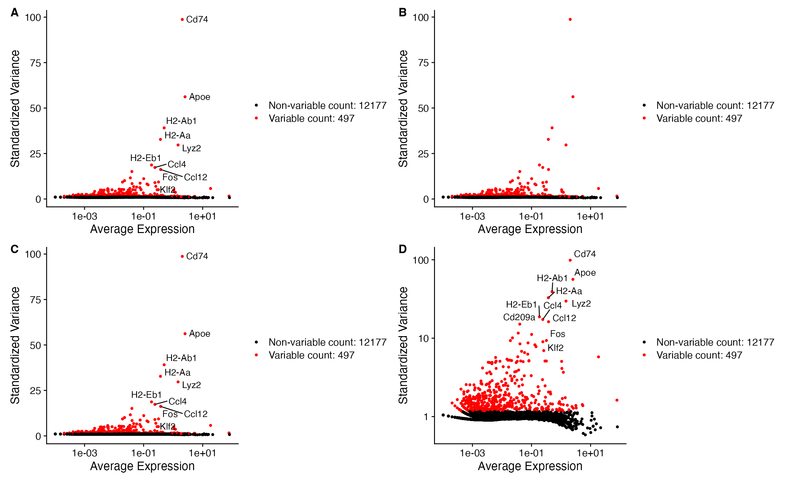
A. Default for
VariableFeaturePlot_scCustom labels features by default.
Plot can be modified by changing function parameters:
B. Setting label = FALSE,
C. Setting repel=TRUE for feature names,
D. Setting y_axis_log=TRUE to plot y-axis
in log scale.
Plotting PC heatmaps and loadings.
For ease in evaluating PCA results scCustomize provides function
PC_Plotting() which returns both PC heatmap and Feature
Loading plot in single patchwork layout.
PC_Plotting(seurat_object = marsh_mouse_micro, dim_number = 2)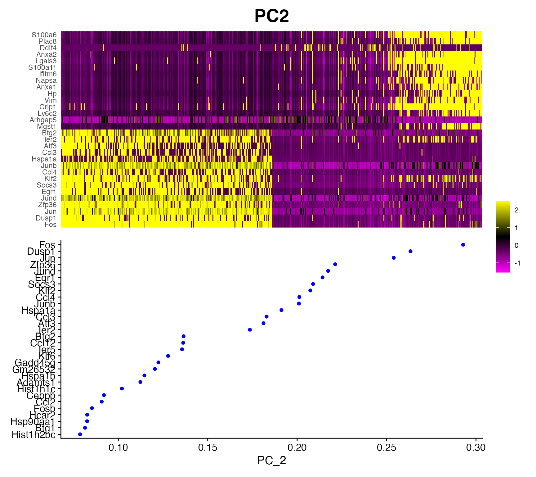
Iterate PC Plotting
This function can be easily enhanced using iterative version
Iterate_PC_Loading_Plots() to return a PDF document that
contains plots for all desired PCs within object. See function manual
and Iterative
Plotting Vignette for more info.
Plot Gene Expression in 2D Space (PCA/tSNE/UMAP)
scCustomize has few functions that improve on the default plotting options/parameters from Seurat and other packages.
FeaturePlots
The default plots fromSeurat::FeaturePlot() are very
good but I find can be enhanced in few ways that scCustomize sets by
default.
Issues with default Seurat settings:
- Parameter
order = FALSEis the default, resulting in potential for non-expressing cells to be plotted on top of expressing cells. - Using custom color palette with greater than 2 colors bins the
expression by the total number of colors.
- Non-expressing cells are part of same color scale which can make it difficult to distinguish low expressing cells from non-expressing cells.
# Set color palette
pal <- viridis(n = 10, option = "C", direction = -1)

# Create Plots
FeaturePlot(object = marsh_mouse_micro, features = "Jun")
FeaturePlot(object = marsh_mouse_micro, features = "Jun", order = T)
FeaturePlot(object = marsh_mouse_micro, features = "Jun", cols = pal, order = T)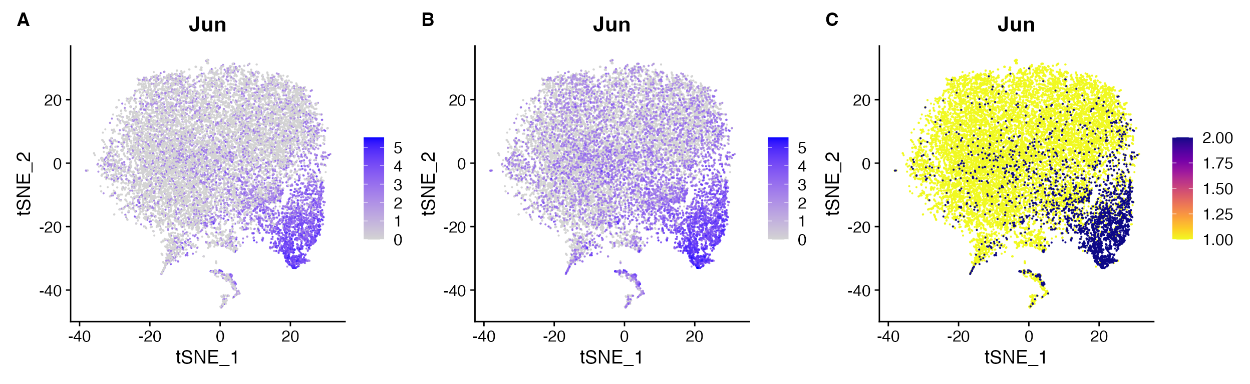
FeaturePlot() non-ideal results: A.
default order = FALSE compared to B.
order = TRUE, C. expression binning when
attempting to set custom gradient using cols
parameter.
FeaturePlot_scCustom solves these
issues
# Set color palette
pal <- viridis(n = 10, option = "D")

# Create Plots
FeaturePlot_scCustom(seurat_object = marsh_mouse_micro, features = "Jun", order = F)
FeaturePlot_scCustom(seurat_object = marsh_mouse_micro, features = "Jun")
FeaturePlot_scCustom(seurat_object = marsh_mouse_micro, features = "Jun", colors_use = pal)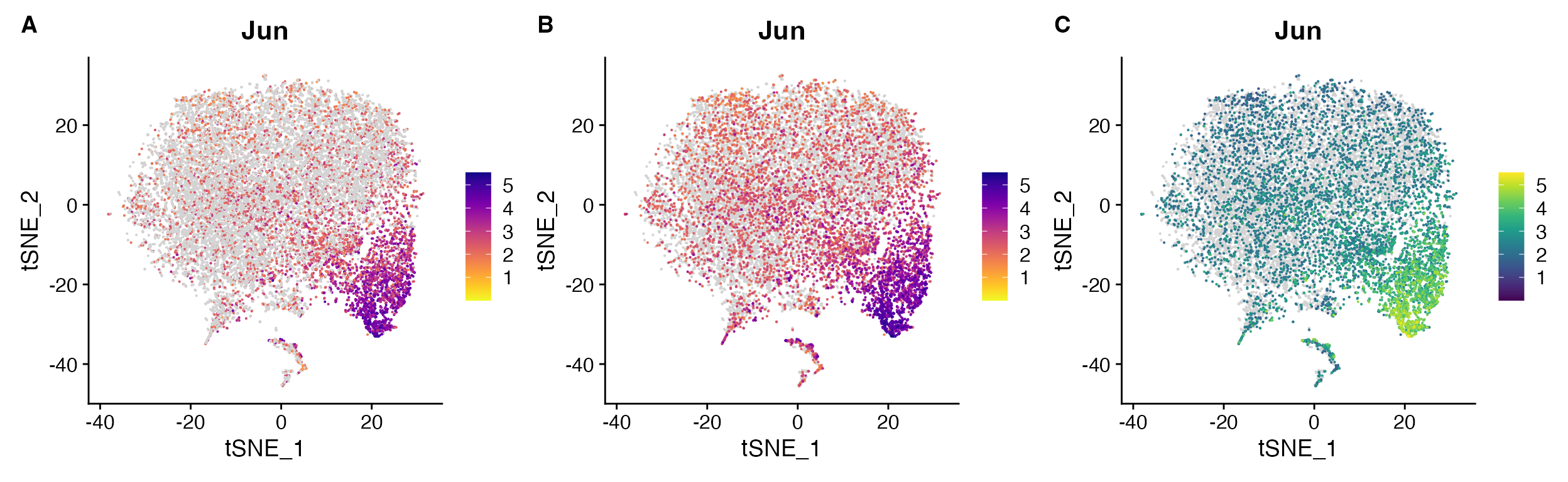
FeaturePlot_scCustom() solves issues:
A. Order can be set to FALSE with optional parameter
when desired. B. However by default is set to TRUE so
additional parameter call not required, C.
FeaturePlot_scCustom() prevents expression binning when
supplying custom color palette.
Sometimes order=TRUE can be distracting though and so
can always set it to FALSE In some cases (especially
likely in snRNA-seq), some of the low expression may simply represent
ambient RNA and therefore plotting with order=FALSE may be
advantageous for visualization (or using different plotting
method).
FeaturePlot_scCustom(seurat_object = marsh_human_pm, features = "P2RY12")
FeaturePlot_scCustom(seurat_object = marsh_human_pm, features = "P2RY12", order = F)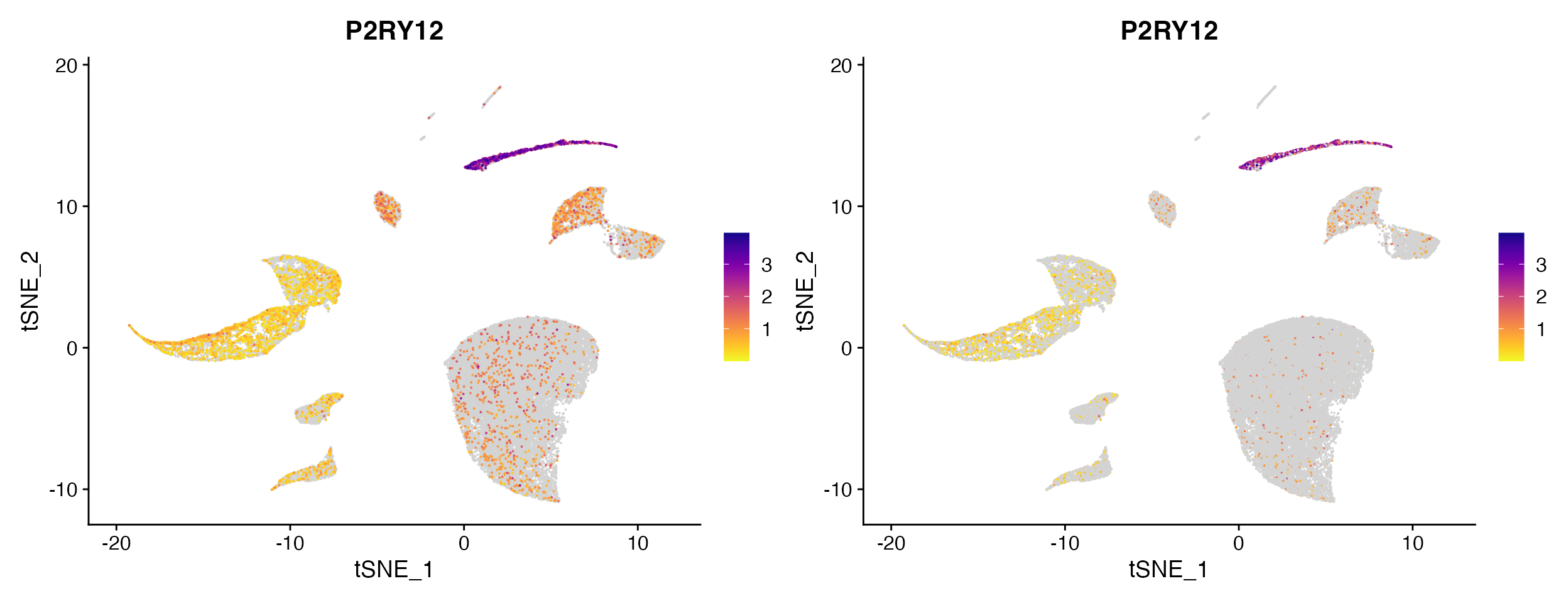
Plotting non-expressing cells as background.
As you can see above FeaturePlot_scCustom() has the
ability to plot non-expressing cells in outside of color scale used for
expressing cells. However it is critical that users pay attention to the
correctly setting the na_cutoff
parameter in FeaturePlot_scCustom.
scCustomize contains a parameter called na_cutoff which
tells the function which values to plot as background. By default this
is set to value that means background is treated as 0 or below.
Depending on what feature, assay, or value you are interested in this
parameter should be modified appropriately.
For instance if plotting module score which contains negative values you will probably want to remove the cutoff value entirely to avoid misconstruing results.
FeaturePlot_scCustom(seurat_object = marsh_mouse_micro, features = "Microglia_Score1")
FeaturePlot_scCustom(seurat_object = marsh_mouse_micro, features = "Microglia_Score1", na_cutoff = NA)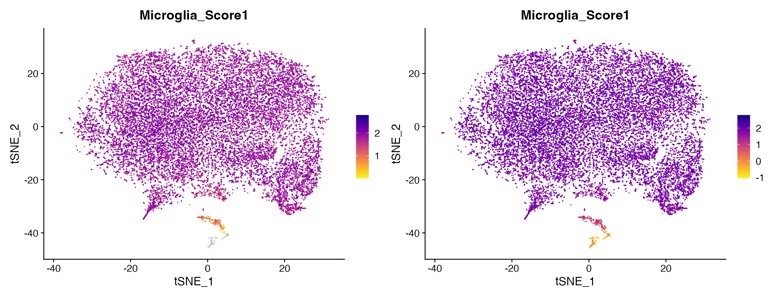
Other times you may actually want to set high na_cutoff value to enable better interpretation of the range of values in particular clusters of interest.
FeaturePlot_scCustom(seurat_object = marsh_human_pm, features = "nFeature_RNA")
FeaturePlot_scCustom(seurat_object = marsh_human_pm, features = "nFeature_RNA", na_cutoff = 6000)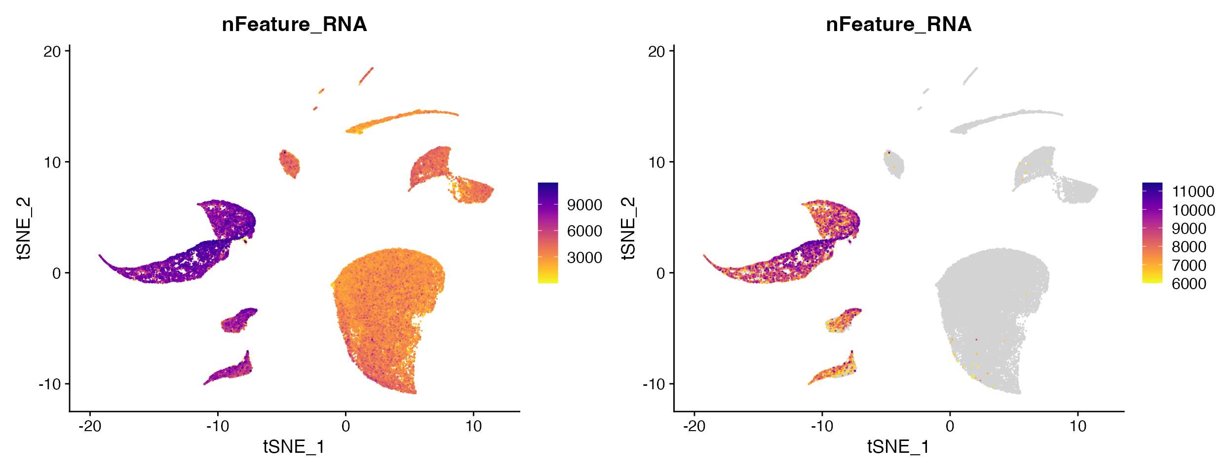
Split Feature Plots
Seurat::FeaturePlot() has additional issues when
splitting by object@meta.data variable.
- Specifying the number of columns in output is no longer possible which makes viewing plots from objects with large numbers of variables difficult.
FeaturePlot(object = marsh_mouse_micro, features = "P2ry12", split.by = "orig.ident")
FeaturePlot() when using split.by outputs
with the number of columns equal to the number of levels in meta.data
column.
FeaturePlot_scCustom solves this issue and allows for setting the number of columns in FeaturePlots
FeaturePlot_scCustom(seurat_object = marsh_mouse_micro, features = "P2ry12", split.by = "sample_id",
    num_columns = 4)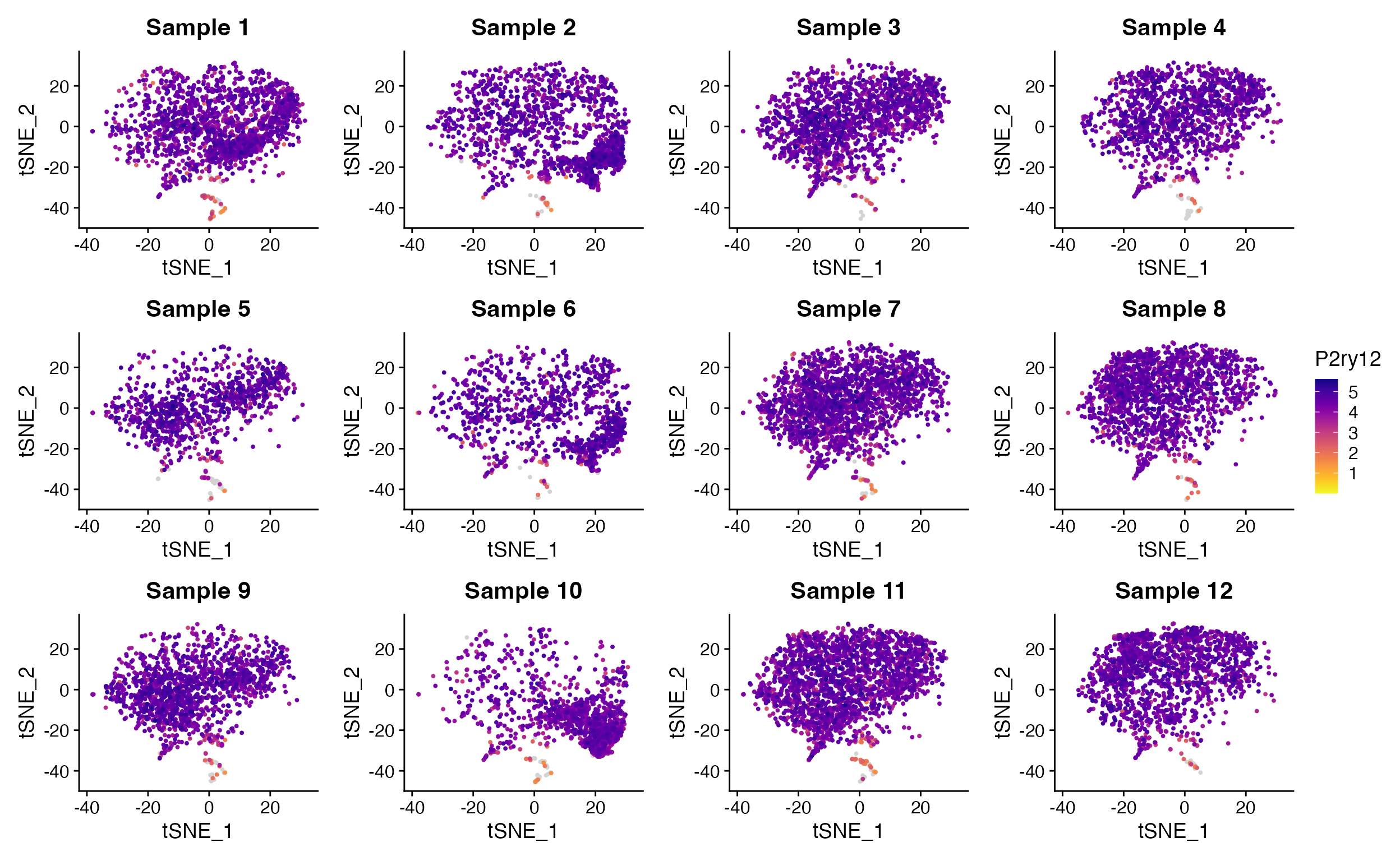
Split_FeaturePlot() solves this issue and restores
ability to set column number using ncolumns parameter.
Change the transparency of points
FeaturePlot_scCustom also allows for customization of
the transparency (alpha) of both the points of expressing cells and
non-expressing cells using optional parameters.
FeaturePlot_scCustom(object = marsh_mouse_micro, features = "Jun", alpha_exp = 0.75)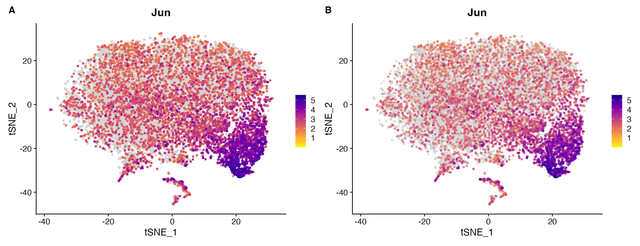
Example comparing A. default
FeaturePlot_scCustom vs. B. plot with
alpha of expressing cells adjusted alpha_exp = 0.55.
Density Plots
The Nebulosa package provides really great functions for plotting gene expression via density plots.
scCustomize provides two functions to extend functionality of these plots and for ease of plotting “joint” density plots.
Custom color palettes
Currently Nebulosa only supports plotting using 1 of 5 viridis color
palettes: “viridis”, “magma”, “cividis”, “inferno”, and “plasma”).
Plot_Density_Custom() changes the default palette to
“magma” and also allows for use of any custom gradient.
Plot_Density_Custom(seurat_object = marsh_mouse_micro, features = "Fos")
Plot_Density_Custom(seurat_object = marsh_mouse_micro, features = "Fos", custom_palette = PurpleAndYellow())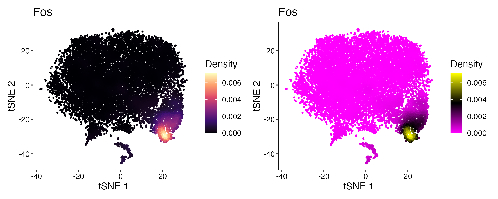
Joint Plots
Often user may only want to return the “Joint” density plot when
providing multiple features. Plot_Density_Joint_Only()
simplifies this requiring only single function and only returns the
joint plot for the features provided.
Plot_Density_Joint_Only(seurat_object = marsh_mouse_micro, features = c("Fos", "Jun"))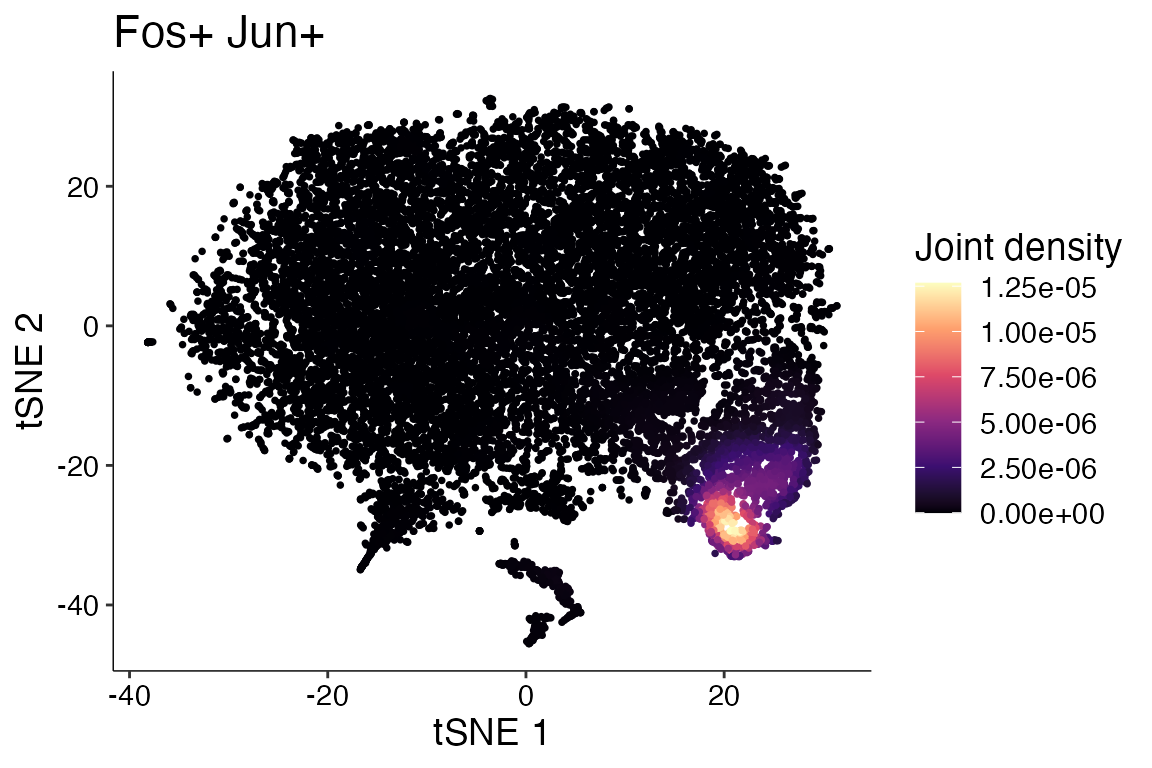
Dual Assay Plotting
In certain situations returning a plot from two different assays within the same object may be advantageous. For instance when object contains but raw and Cell Bender corrected counts you may want to plot the same gene from both assays to view the difference. See Cell Bender Functionality vignette for more info.
cell_bender_example <- qs_read("assets/astro_nuc_seq.qs2")
FeaturePlot_DualAssay(seurat_object = cell_bender_example, features = "Syt1", assay1 = "RAW", assay2 = "RNA")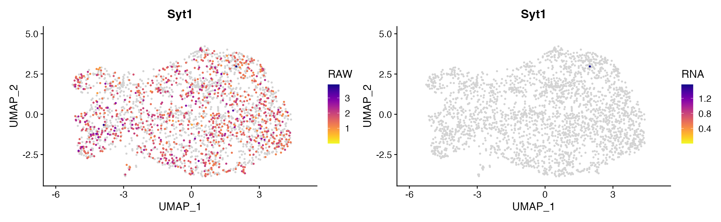
Non-2D Gene Expression Plots (Violin, Dot, etc)
Stacked Violin Plots
Often plotting many genes simultaneously using Violin plots is
desired. scCustomize provides Stacked_VlnPlot() for a more
aesthetic stacked violin plot compared to stacked plots that can be made
using default Seurat::VlnPlot().
The original version of this function was written by Ming Tang and
posted
on his blog. Function is included with permission and
authorship.
gene_list_plot <- c("SLC17A7", "GAD2", "AQP4", "MYT1", "COL1A2", "CLDN5", "OPALIN", "CX3CR1", "CD3E")
human_colors_list <- c("dodgerblue", "navy", "forestgreen", "darkorange2", "darkorchid3", "orchid",
    "orange", "gold", "gray")

# Create Plots
Stacked_VlnPlot(seurat_object = marsh_human_pm, features = gene_list_plot, x_lab_rotate = TRUE,
    colors_use = human_colors_list)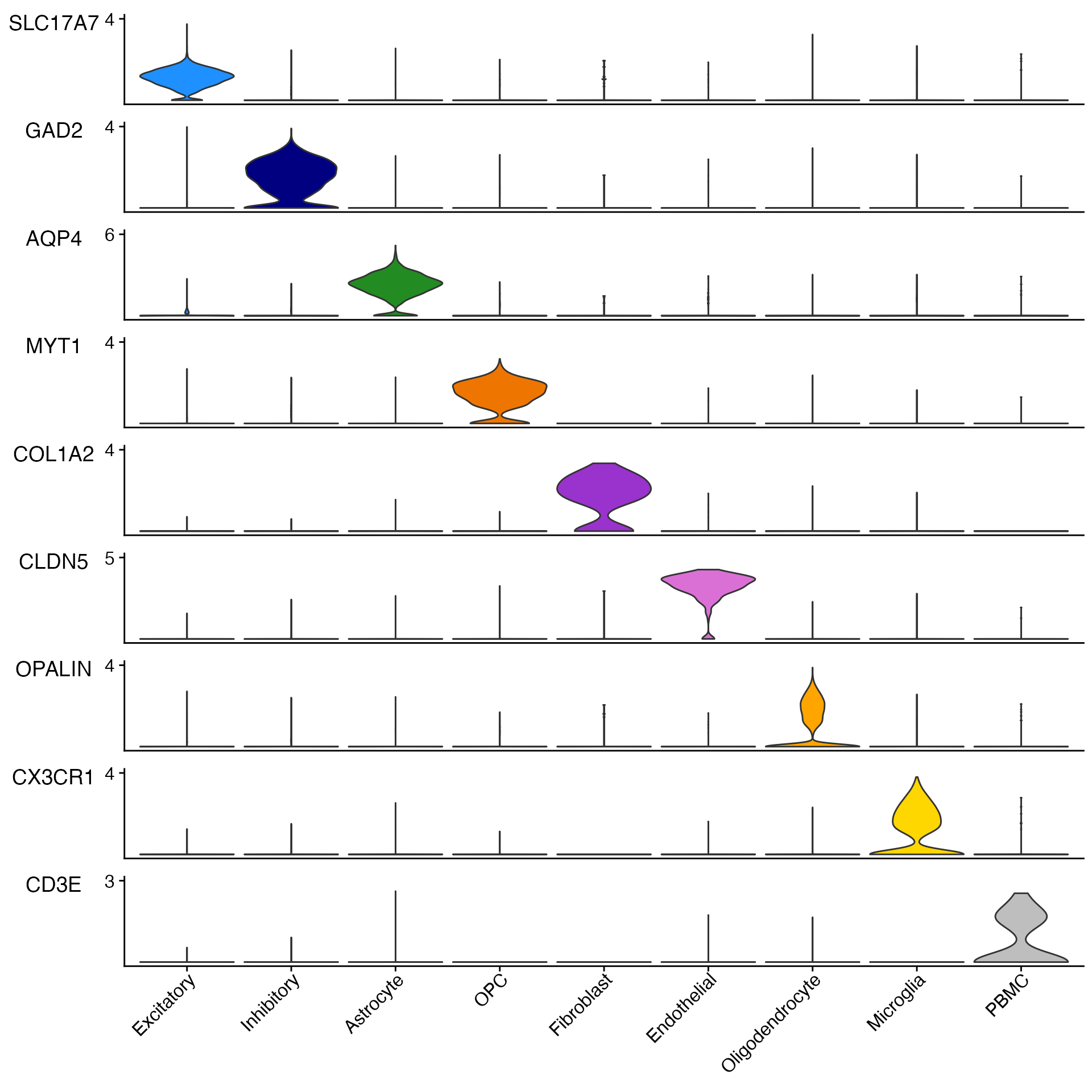
Stacked_VlnPlot also supports any additional parameters
that are part of Seurat::VlnPlot()
For instance splitting plot by meta data feature.
sample_colors <- c("dodgerblue", "forestgreen", "firebrick1")

# Create Plots
Stacked_VlnPlot(seurat_object = marsh_human_pm, features = gene_list_plot, x_lab_rotate = TRUE,
    colors_use = sample_colors, split.by = "orig.ident")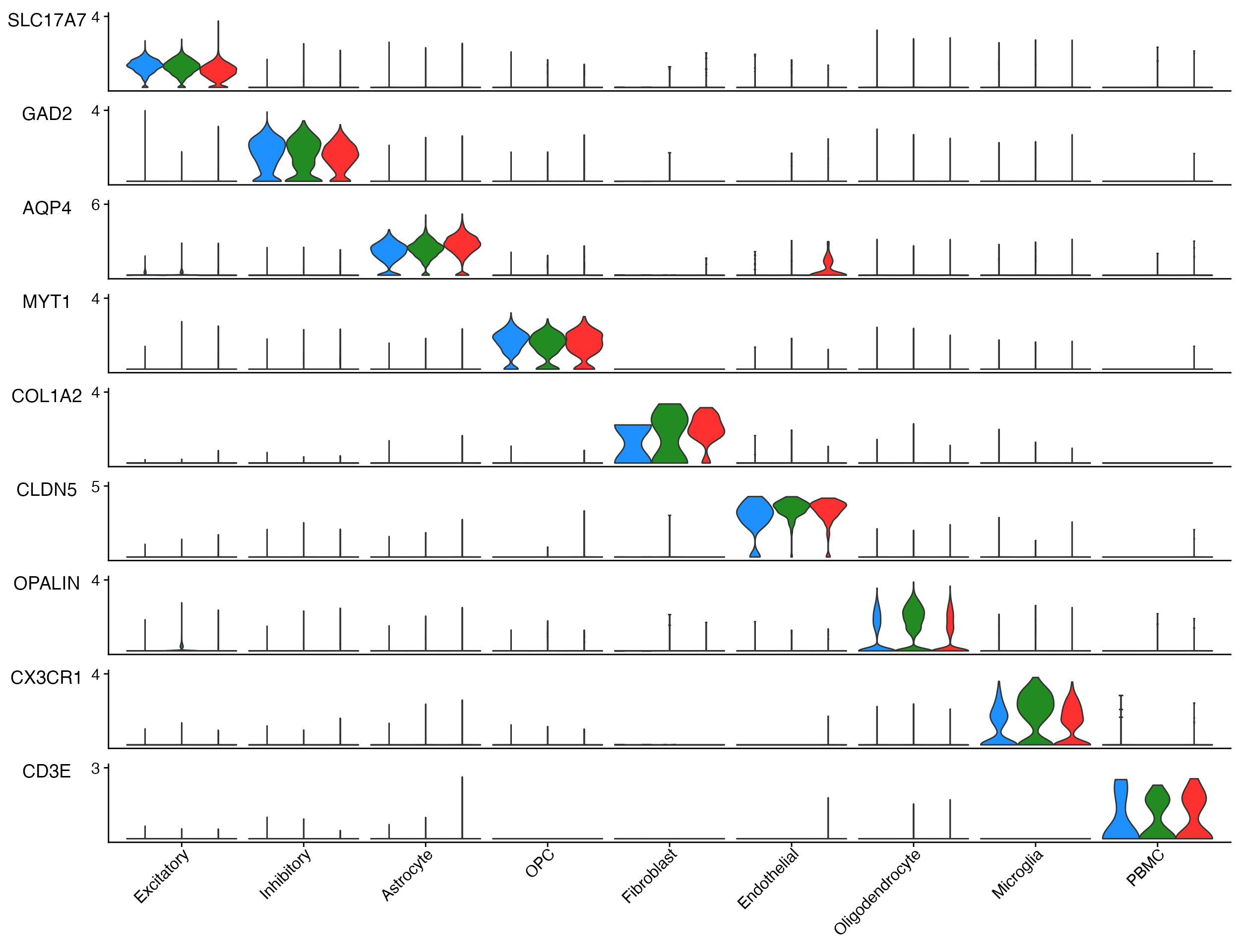
Example plot adding the split.by parameter to view
expression by sample and cell type.
Adjust Vertical Plot Spacing
Depending on number of genes plotted and user preferences it may be
helpful to change the vertical spacing between plots. This can be done
using the plot_spacing and spacing_unit
parameters.
# Default plot spacing (plot_spacing = 0.15 and spacing_unit = 'cm')
Stacked_VlnPlot(seurat_object = pbmc, features = c("CD3E", "CD14", "MS4A1", "FCER1A", "PPBP"), x_lab_rotate = TRUE)

# Double the space between plots
Stacked_VlnPlot(seurat_object = pbmc, features = c("CD3E", "CD14", "MS4A1", "FCER1A", "PPBP"), x_lab_rotate = TRUE,
    plot_spacing = 0.3)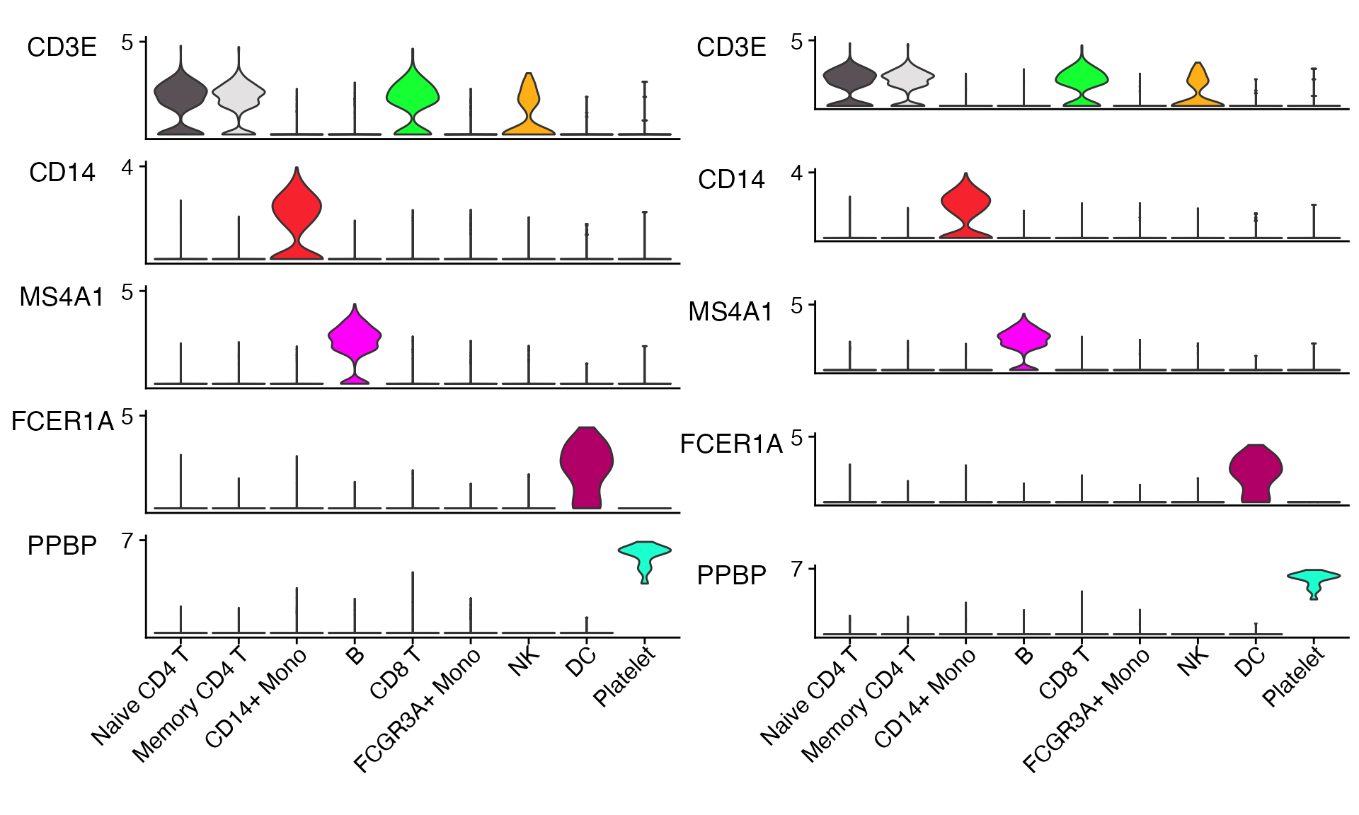
Adjusting Plot Size
Please note that even more so than many other plots you will need to adjust the height and width of these plots significantly depending on the number of features and number of identities being plotted.
Stacked_VlnPlot also supports plotting of
object@meta.data variables (i.e. mito% or module scores).
Stacked_VlnPlot(seurat_object = marsh_human_pm, features = c("percent_mito", "percent_ribo"), x_lab_rotate = TRUE,
    colors_use = human_colors_list)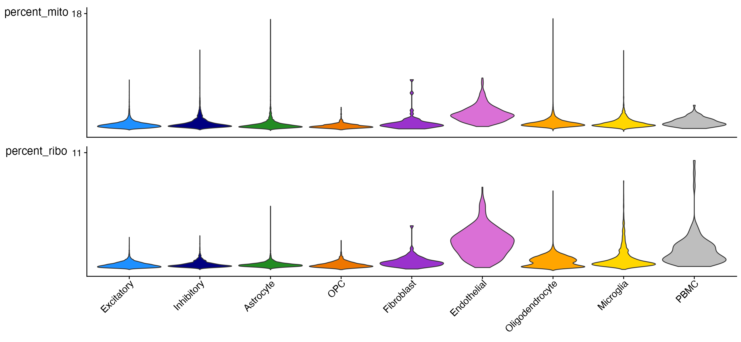
Point Size and Rasterization
By default Stacked_VlnPlot sets the pt.size
parameter to 0 to accelerate plotting/rendering which slow down
dramatically depending on size of dataset and number of features
plotted.
If points are still desired then plotting/rendering can be sped up by
using the raster parameter. By default raster will be set
to TRUE if pt.size > 0 and
number of cells x number of features > 100,000.
Custom VlnPlots
In addition to Stacked_VlnPlot scCustomize also features
a modified version of Seurat’s VlnPlot().
VlnPlot_scCustom provides unified color palette
plotting
VlnPlot(object = pbmc, features = "PTPRC")
VlnPlot_scCustom(seurat_object = pbmc, features = "PTPRC")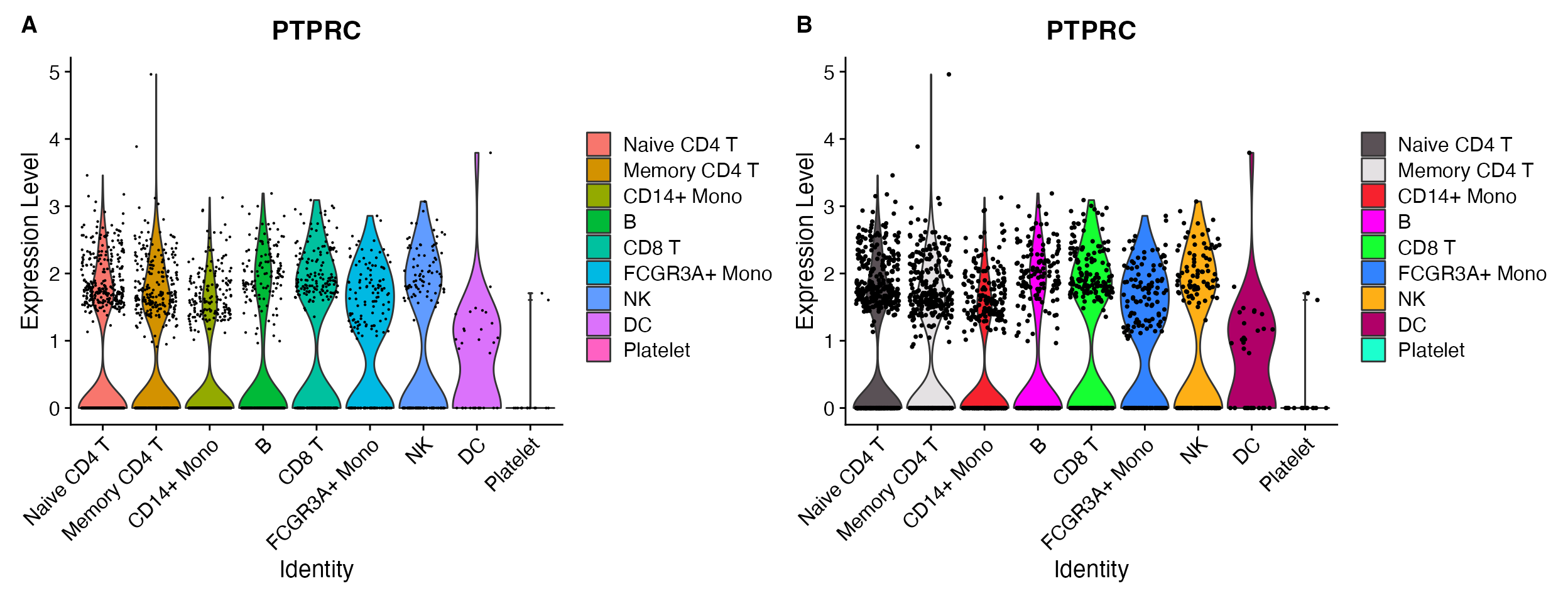
A. Default VlnPlot with ggplot2
default color scheme. B. VlnPlot_scCustom
shares color palette choice with other scCustomize functions.
Support for Rasterization
Seurat VlnPlot() supports rasterization but does not
alter it’s plotting behavior by default. Both
Stacked_VlnPlot and VlnPlot_scCustom have a
built in check to automatically rasterize the points if the:
number of cells x number of features > 100,000 to
accelerate plotting when vector plots are not necessary.
Rasterization can also be manually turned on or off using the
raster parameter
VlnPlot_scCustom(seurat_object = pbmc, features = "PTPRC", raster = FALSE)
VlnPlot_scCustom(seurat_object = pbmc, features = "PTPRC", raster = TRUE)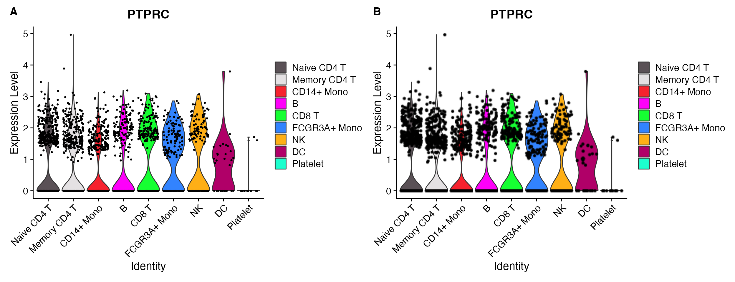
A. raster = FALSE. B.
raster = TRUE.
Further customization
scCustomize VlnPlot_scCustom can be further customized
to display the median value for each idenity or add boxplot on top of
the violin.
VlnPlot_scCustom(seurat_object = pbmc, features = "PTPRC", plot_median = TRUE) & NoLegend()
VlnPlot_scCustom(seurat_object = pbmc, features = "PTPRC", plot_boxplot = TRUE) & NoLegend()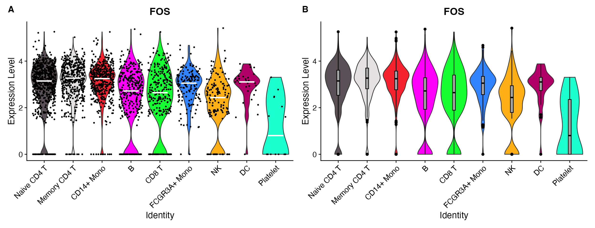
A. Add median value to plot. B. Add boxplot on top of plot.
Custom DotPlots
Seurat’s DotPlot() function is really good but lacks the
ability to provide custom color gradient of more than 2 colors.
DotPlot_scCustom() allows for plotting with custom
gradients.
micro_genes <- c("P2ry12", "Fcrls", "Trem2", "Tmem119", "Cx3cr1", "Hexb", "Tgfbr1", "Sparc", "P2ry13",
    "Olfml3", "Adgrg1", "C1qa", "C1qb", "C1qc", "Csf1r", "Fcgr3", "Ly86", "Laptm5")

DotPlot(object = marsh_mouse_micro, features = micro_genes[1:6], cols = viridis_plasma_dark_high)
DotPlot_scCustom(seurat_object = marsh_mouse_micro, features = micro_genes[1:6], colors_use = viridis_plasma_dark_high)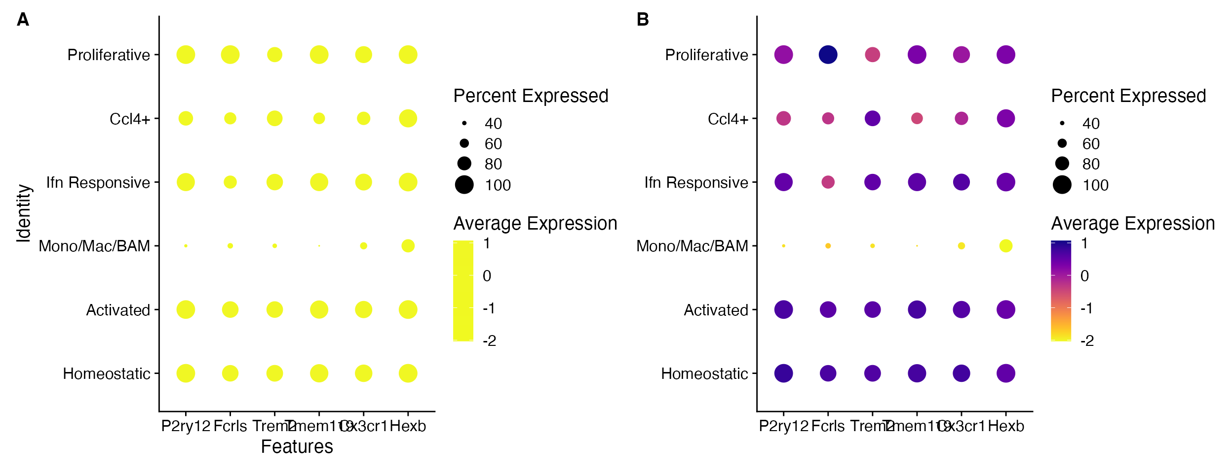
A. Default DotPlot only takes the
first few colors when a gradient is provided. B.
DotPlot_scCustom allows for use of gradients in full while
maintaining visualization.
DotPlot_scCustom() also contains additional parameters
for easy manipulations of axes for better plotting.
These allow for:
-
x_lab_rotaterotating x-axis text Default is FALSE. -
y_lab_rotaterotating y-axis text Default is FALSE. -
flip_axesflip the axes. Default is FALSE. -
remove_axis_titlesremove the x- and y-axis labels. Default is TRUE
DotPlot_scCustom(seurat_object = marsh_mouse_micro, features = micro_genes[1:6], x_lab_rotate = TRUE)
DotPlot_scCustom(seurat_object = marsh_mouse_micro, features = micro_genes[1:6], y_lab_rotate = TRUE)
DotPlot_scCustom(seurat_object = marsh_mouse_micro, features = micro_genes[1:6], flip_axes = T,
    x_lab_rotate = TRUE)
DotPlot_scCustom(seurat_object = marsh_mouse_micro, features = micro_genes[1:6], flip_axes = T,
    remove_axis_titles = FALSE)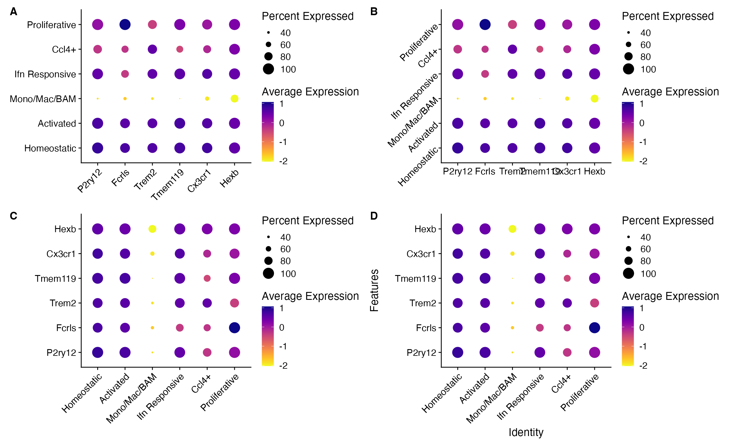
A. Rotate x-axis text, B. Rotate y-axis text, C. flip axes and rotate x-axis text, and D. Add axis labels (removed by default).
Clustered DotPlots
For a more advanced take on the DotPlot scCustomize
contains a separate function Clustered_DotPlot(). This
function allows for clustering of both gene expression patterns and
identities in the final plot. The original version of this function
was written by Ming Tang and posted
on his blog. Function is included with permission, authorship, and
assistance.
# Find markers and limit to those expressed in greater than 75% of target population
all_markers <- FindAllMarkers(object = pbmc) %>%
    Add_Pct_Diff() %>%
    filter(pct_diff > 0.6)

top_markers <- Extract_Top_Markers(marker_dataframe = all_markers, num_features = 7, named_vector = FALSE,
    make_unique = TRUE)

Clustered_DotPlot(seurat_object = pbmc, features = top_markers)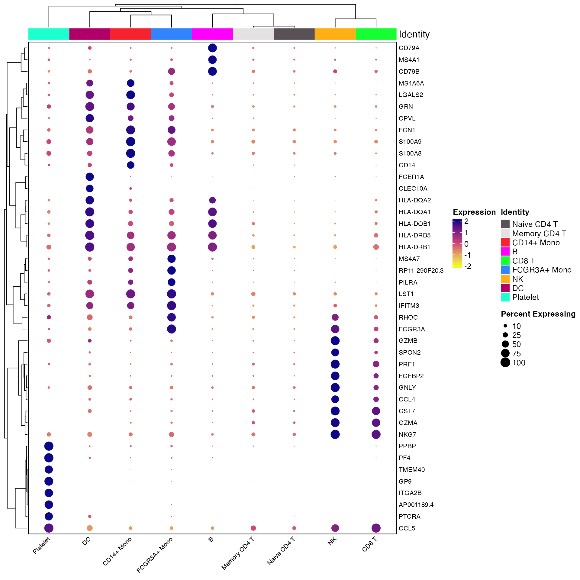
Cluster Plot on Gene Expression Patterns
By default Clustered_DotPlot performs k-means clustering
with k value set to 1. However, users can change this value to enable
better visualization of expression patterns.
Clustered_DotPlot(seurat_object = pbmc, features = top_markers, k = 8)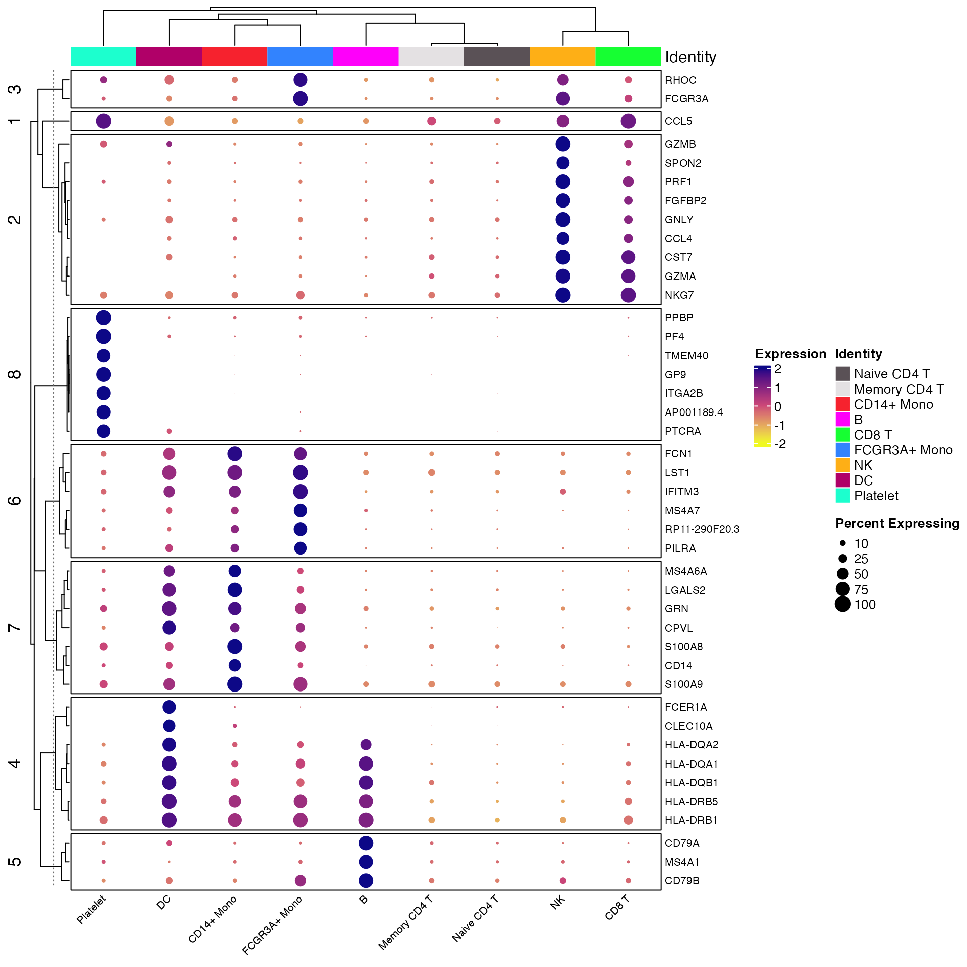
You can also change the location and orientation of the plot legends. For instance here we move the legend to the bottom of the plot and reorient the legend to display horizontally. We also remove the identity legend as redundant information (and it takes up a lot of room when horizontal).
plots <- Clustered_DotPlot(seurat_object = pbmc, features = top_markers, k = 8, plot_km_elbow = FALSE,
    legend_position = "bottom", legend_orientation = "horizontal", show_ident_legend = FALSE)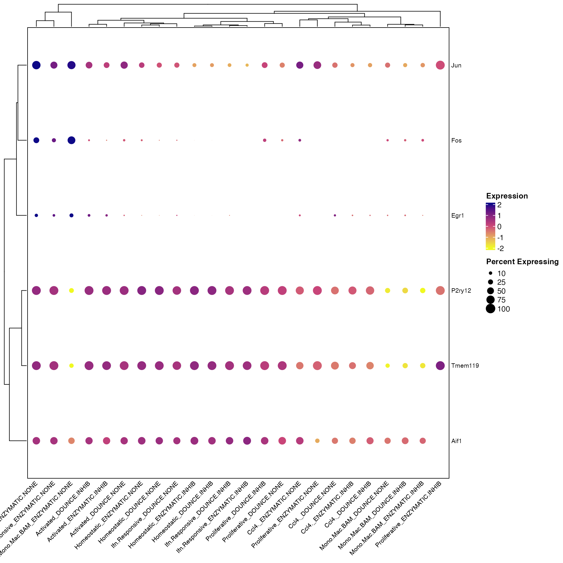
Clustered_DotPlot() only label a subset of plotted features
You can also provide a subset of plotted features to the optional
parameter label_selected_features to only label those
features on the resulting plot. This can be especially useful when
plotting large number of features. Just be sure to heed warning messages
regarding how to save plots accurately.
# Select large number of features
top_markers_large <- Extract_Top_Markers(marker_dataframe = all_markers, num_features = 15, named_vector = FALSE,
    make_unique = TRUE)

# label only top 5 features
top_markers_subset <- Extract_Top_Markers(marker_dataframe = all_markers, num_features = 7, named_vector = FALSE,
    make_unique = TRUE)

plots <- Clustered_DotPlot(seurat_object = pbmc, features = top_markers_large, label_selected_features = top_markers_subset,
    k = 8, plot_km_elbow = FALSE)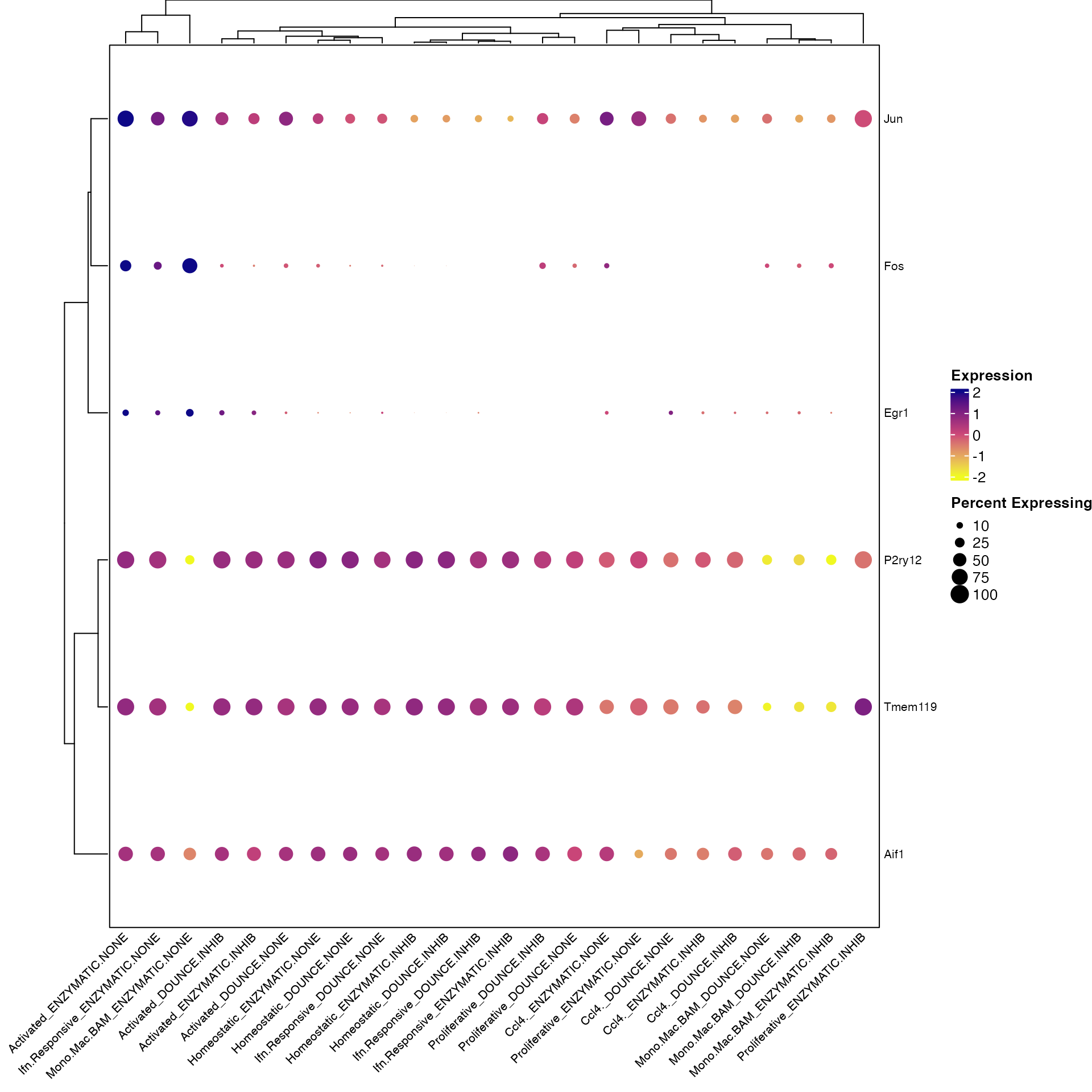
Clustered_DotPlot() split by additional grouping variable
Clustered_DotPlot can now plot with additional grouping
variable provided to split.by parameter.
Clustered_DotPlot(seurat_object = marsh_mouse_micro, features = c("Fos", "Jun", "Egr1", "Aif1",
    "P2ry12", "Tmem119"), split.by = "Transcription_Method")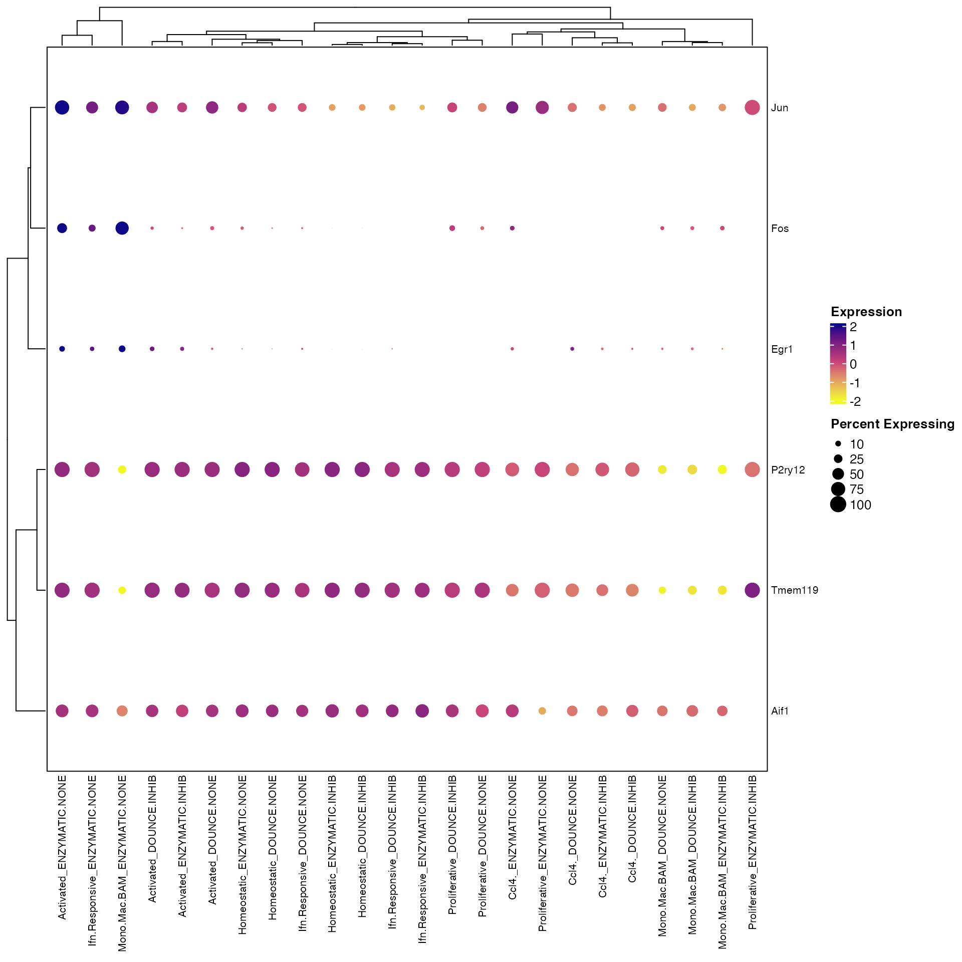
However, you’ll notice that the labels on the bottom get cutoff on the left-hand side of the plot. There are two solutions to this.
Keep bottom labels rotated but add extra white-space padding on left
Clustered_DotPlot(seurat_object = marsh_mouse_micro, features = c("Fos", "Jun", "Egr1", "Aif1",
    "P2ry12", "Tmem119"), split.by = "Transcription_Method", plot_padding = TRUE)
Or simply remove the bottom label text rotation
Clustered_DotPlot(seurat_object = marsh_mouse_micro, features = c("Fos", "Jun", "Egr1", "Aif1",
    "P2ry12", "Tmem119"), split.by = "Transcription_Method", x_lab_rotate = 90)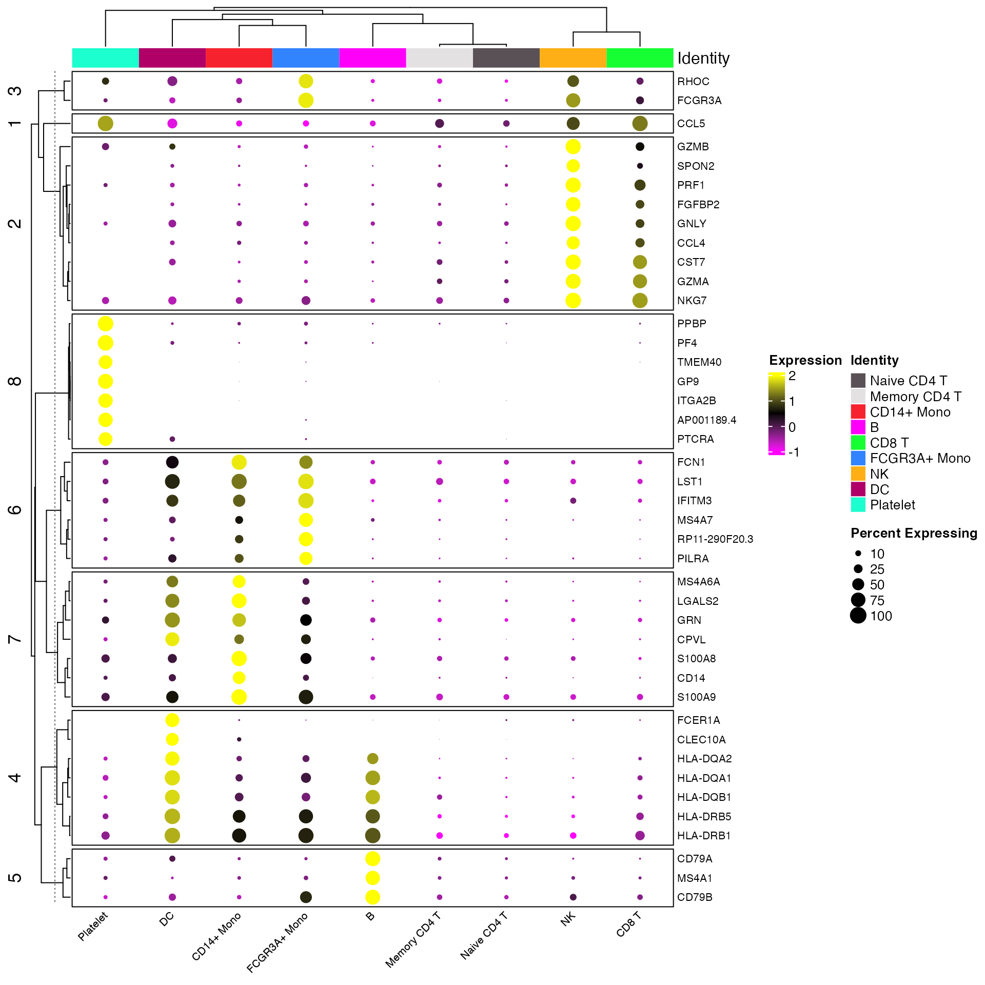
Clustered_DotPlot() k-means Clustering Optional Parameters
Determining Optimal k Value
There are many methods that can be used to aid in determining an optimal
value for k in k-means clustering. One of the simplest is to the look at
the elbow in sum of squares error plot. By default
Clustered_DotPlot will return this plot when using the
function. However, it can be turned off by setting
plot_km_elbow = FALSE.
plots <- Clustered_DotPlot(seurat_object = pbmc, features = top_markers, k = 8, plot_km_elbow = TRUE,
    legend_position = "bottom", legend_orientation = "horizontal", show_ident_legend = FALSE)

plots[[1]]
plots[[1]]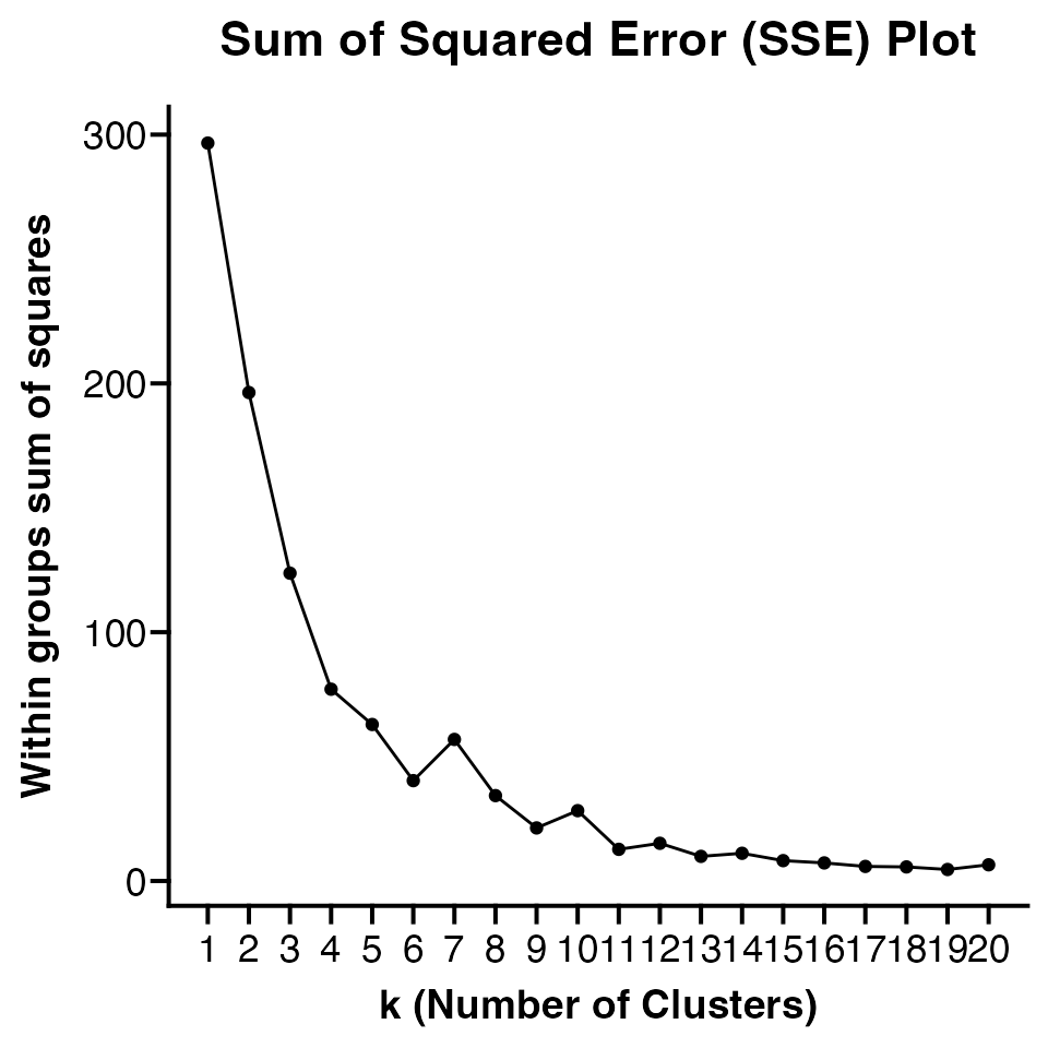
The number of k values plotted must be 1 less than number of
features. Default is to plot 20 values but users can customize number of
k values plotted using elbow_kmax parameter.
Consensus k-means Clustering
By default Clustered_DotPlot uses consensus k-means
clustering with 1000 repeats for both the columns and rows. However,
user can reduce or increase these values as desired by supplying new
value to either or both of
row_km_repeats/column_km_repeats
Clustered_DotPlot() Expression Scale Optional Parameters
There are a number of optional parameters that can be modified by user depending on the desired resulting plot.
-
colors_use_expto provide custom color scale -
exp_color_min/exp_color_maxcan be used to clip the min and max values on the expression scale. -
print_exp_quantilescan be set to TRUE to print the expression quantiles to aid in setting newexp_color_min/exp_color_max. -
exp_color_middlecan be used to change what value is used for the middle of the color scale. By default is set to the middle ofexp_color_min/exp_color_maxbut can be modified if a skewed visualization is desired.
Clustered_DotPlot(seurat_object = pbmc, features = top_markers, k = 8, print_exp_quantiles = T)Here we can adjust the expression clipping based on the range of the
data in this specific dataset and list of features and change the color
scale to use Seurat::PurpleAndYellow()
Clustered_DotPlot(seurat_object = pbmc, features = top_markers, k = 8, exp_color_min = -1, exp_color_max = 2,
    colors_use_exp = PurpleAndYellow())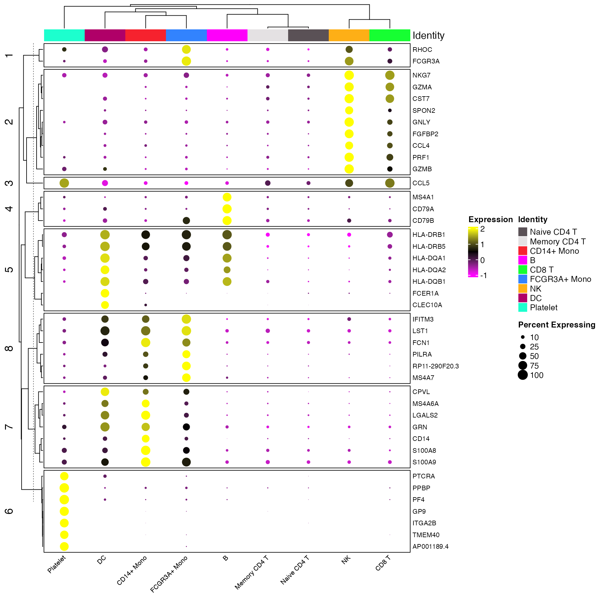
Clustered_DotPlot() Other Optional Parameters
-
colors_use_identsColors to use for the identities (columns) plotted.
-
show_ident_colorsandshow_ident_legendto show or hide the identity colors on plot and/or identity legend. Default is TRUE.
-
x_lab_rotateLogical or Integer. Default is TRUE (45 degree column label rotation). FALSE (0 degree rotation). Integer for custom text rotation value.
-
row_label_sizeChange size of row text (gene symbols).
-
show_row_namesandshow_column_namesto show or hide the column and row names. Default is TRUE. -
column_names_sideandrow_names_sideto change the location of column and row labels. Default iscolumn_names_side = "bottom"androw_names_side = "right".
-
rasterWhether to rasterize the plot (faster and smaller file size). Default is FALSE.
FeatureScater Plots
The scCustomize function FeatureScatter_scCustom() is a
slightly modified version of Seurat::FeatureScatter() with
some different default settings and parameter options.
FeatureScatter_scCustom() plots can be very useful when
comparing between two genes/features or comparing module scores. By
default scCustomize version sets shuffle = TRUE to ensure
that points are not hidden due to order of plotting.
# Create Plots
FeatureScatter_scCustom(seurat_object = marsh_mouse_micro, feature1 = "exAM_Score1", feature2 = "Microglia_Score1",
    colors_use = mouse_colors, group.by = "ident", num_columns = 2, pt.size = 1)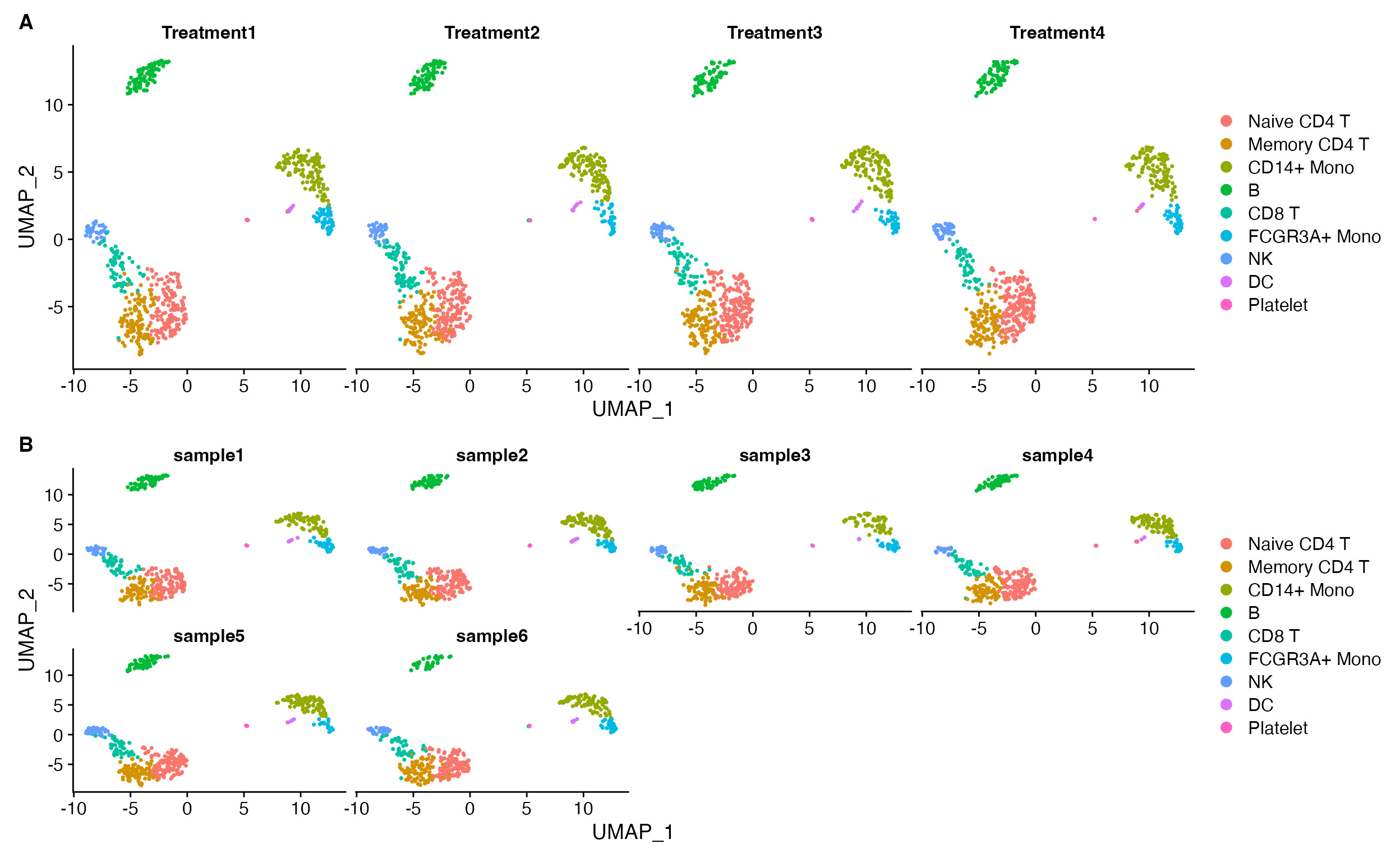
Split FeatureScatter Plots
scCustomize previously contained function
Split_FeatureScatter as Seurat’s plot lacked that
functionality. However, that is now present and
Split_FeatureScatter has therefore been deprecated and it’s
functionality moved within FeatureScatter_scCustom.
FeatureScatter_scCustom() contains two options for
splitting plots (similar to DimPlot_scCustom. The default
is to return each plot with their own x and y axes, which has a number
of advantages (see DimPlot_scCustom section).
# Create Plots
FeatureScatter_scCustom(seurat_object = marsh_mouse_micro, feature1 = "exAM_Score1", feature2 = "Microglia_Score1",
    colors_use = mouse_colors, split.by = "Transcription_Method", group.by = "ident", num_columns = 2,
    pt.size = 1)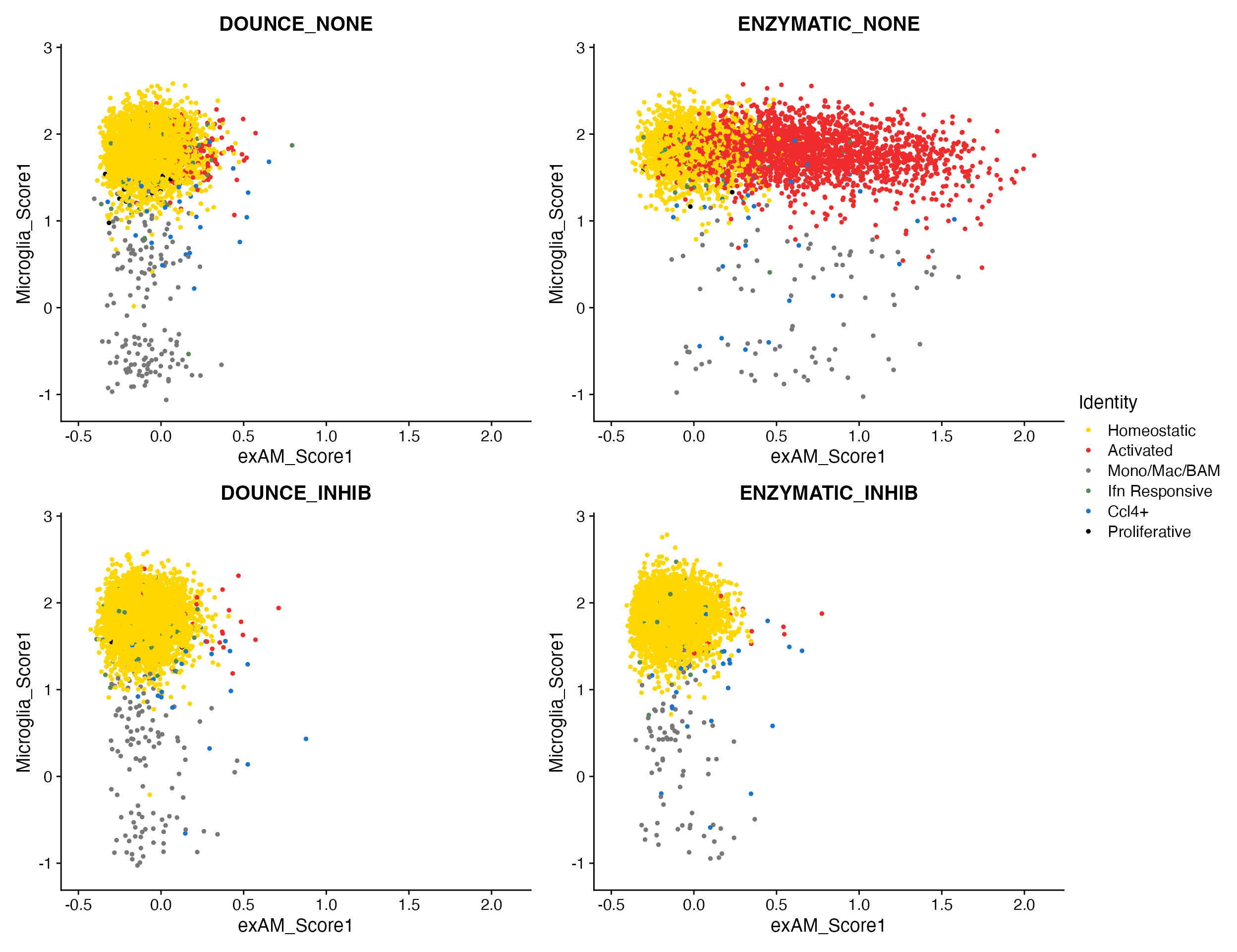
Heatmaps
While scCustomize does not have a custom heatmap plot itself (yet…) it does have functions that can make cell-level heatmaps easier to view/interpret. By default the heatmap in Seurat will size the groups on the heatmap based om their size in the dataset. This can make it very hard to view the results (especially for small clusters).
# Selection fo cluster marker genes
micro_markers <- c("P2ry12", "Cx3cr1", "Fos", "Hspa1a", "Ms4a7", "Ccr2", "Isg15", "Ifit3", "Lpl",
    "Plaur", "Mki67", "Top2a")

DoHeatmap(object = marsh_mouse_micro, features = micro_markers)
# Selection fo cluster marker genes
micro_markers <- c("P2ry12", "Cx3cr1", "Fos", "Hspa1a", "Ms4a7", "Ccr2", "Isg15", "Ifit3", "Lpl",
    "Plaur", "Mki67", "Top2a")


marsh_mouse_micro2 <- ScaleData(marsh_mouse_micro, features = micro_markers)


DoHeatmap(object = marsh_mouse_micro2, features = micro_markers)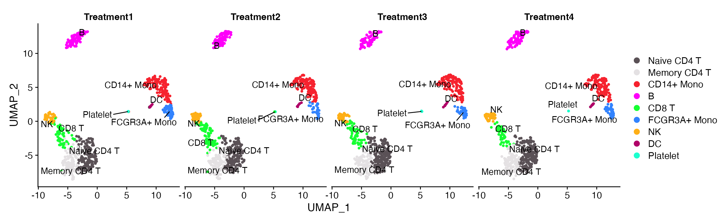
Very hard to view the results for anything but the Homeostatic and activated clusters
While this can be helpful in someways to gauge cluster size other visualizations are usually better for that and heatmaps are usually aimed at informing relative (scaled) gene expression across clusters, groups, etc.
We can solve this issue by downsampling which cells are used in the plot so that number of cells is equal across all groups.
First we need to get idea of how many cells are in each identity.
scCustomize provides the Cluster_Stats_All_Samples function
to make this easy.
cluster_stats <- Cluster_Stats_All_Samples(seurat_object = marsh_mouse_micro)

cluster_stats| Cluster | Number | Freq | 1 | 2 | 3 | 4 | 5 | 6 | 7 | 8 | 9 | 10 | 11 | 12 | 1_% | 2_% | 3_% | 4_% | 5_% | 6_% | 7_% | 8_% | 9_% | 10_% | 11_% | 12_% |
|---|---|---|---|---|---|---|---|---|---|---|---|---|---|---|---|---|---|---|---|---|---|---|---|---|---|---|
| Homeostatic | 15993 | 81.7512651 | 1518 | 930 | 1552 | 1323 | 912 | 728 | 1931 | 1609 | 1441 | 429 | 2087 | 1533 | 79.2275574 | 57.0202330 | 95.0980392 | 92.2594142 | 92.0282543 | 61.904762 | 94.6568627 | 96.0597015 | 94.3062827 | 24.6551724 | 94.4771390 | 96.3544940 |
| Activated | 2670 | 13.6482135 | 293 | 651 | 14 | 46 | 3 | 402 | 16 | 4 | 5 | 1220 | 12 | 4 | 15.2922756 | 39.9141631 | 0.8578431 | 3.2078103 | 0.3027245 | 34.183673 | 0.7843137 | 0.2388060 | 0.3272251 | 70.1149425 | 0.5432322 | 0.2514142 |
| Mono/Mac/BAM | 426 | 2.1775801 | 68 | 21 | 23 | 29 | 48 | 15 | 44 | 25 | 32 | 49 | 49 | 23 | 3.5490605 | 1.2875536 | 1.4093137 | 2.0223152 | 4.8435923 | 1.275510 | 2.1568627 | 1.4925373 | 2.0942408 | 2.8160920 | 2.2181983 | 1.4456317 |
| Ifn Responsive | 281 | 1.4363850 | 21 | 14 | 23 | 22 | 10 | 16 | 34 | 30 | 22 | 26 | 45 | 18 | 1.0960334 | 0.8583691 | 1.4093137 | 1.5341702 | 1.0090817 | 1.360544 | 1.6666667 | 1.7910448 | 1.4397906 | 1.4942529 | 2.0371209 | 1.1313639 |
| Ccl4+ | 166 | 0.8485406 | 11 | 15 | 18 | 14 | 13 | 13 | 13 | 6 | 23 | 14 | 13 | 13 | 0.5741127 | 0.9196812 | 1.1029412 | 0.9762901 | 1.3118063 | 1.105442 | 0.6372549 | 0.3582090 | 1.5052356 | 0.8045977 | 0.5885016 | 0.8170962 |
| Proliferative | 27 | 0.1380156 | 5 | 0 | 2 | 0 | 5 | 2 | 2 | 1 | 5 | 2 | 3 | 0 | 0.2609603 | 0.0000000 | 0.1225490 | 0.0000000 | 0.5045409 | 0.170068 | 0.0980392 | 0.0597015 | 0.3272251 | 0.1149425 | 0.1358081 | 0.0000000 |
| Total | 19563 | 100.0000000 | 1916 | 1631 | 1632 | 1434 | 991 | 1176 | 2040 | 1675 | 1528 | 1740 | 2209 | 1591 | 100.0000000 | 100.0000000 | 100.0000000 | 100.0000000 | 100.0000000 | 100.000000 | 100.0000000 | 100.0000000 | 100.0000000 | 100.0000000 | 100.0000000 | 100.0000000 |
Now we can use the function Random_Cells_Downsample to
return a downsampled selection of cells from each identity. We can
either set the num_cells parameter manually to the smallest
group or simply provide "min".
In this case that would 27 cells per group. which is a bit small to
get representative sample when other groups are much larger. So
alternatively, we can set a larger value (150 cells) and change the
optional parameter allow_lower to TRUE. This
means that all groups larger than 150 cells will get downsampled but any
smaller will simply return all cells in that ident.
# random cells can either be return to environment
random_cells_150 <- Random_Cells_Downsample(seurat_object = marsh_mouse_micro, num_cells = 150,
    allow_lower = T)

DoHeatmap(object = marsh_mouse_micro, features = micro_markers, cells = random_cells_150)

# Or called within the `DoHeatmap` function.
DoHeatmap(object = marsh_mouse_micro, features = micro_markers, cells = Random_Cells_Downsample(seurat_object = marsh_mouse_micro,
    num_cells = 150, allow_lower = T))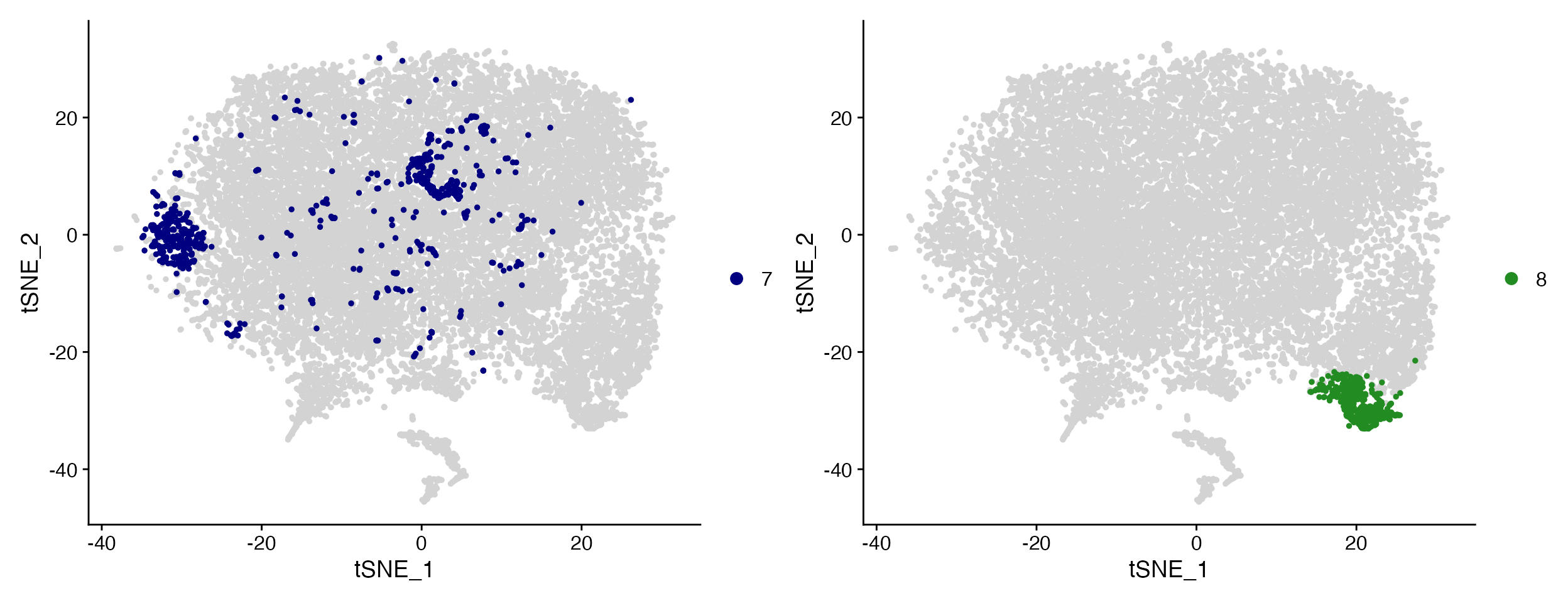
Much easier now to see expression across all clusters.
DimPlots: Plot Meta Data in 2D Space (PCA/tSNE/UMAP)
scCustomize has a few functions that improve on the default plotting options available in Seurat
DimPlots
The scCustomize function DimPlot_scCustom() is a
slightly modified version of Seurat::DimPlot() with some
different default settings and parameter options.
New default color palettes
The default ggplot2 hue palette becomes very hard to distinguish
between at even a moderate number of clusters for a scRNA-seq
experiment. scCustomize’s function DimPlot_scCustom sets
new default color palettes:
- If less than or equal to 36 groups plotted then the “polychrome” palette will be used.
- If more than 36 groups the “varibow” palette will be used with
shuffle_pal = TRUE. - If user wants to use ggplot2 hue palette then set parameter
ggplot_default_colors = TRUE.
To best demonstrate rationale for this I’m going to use
over-clustered version of the marsh_mouse_micro object.
DimPlot(object = marsh_mouse_over)
DimPlot_scCustom(seurat_object = marsh_mouse_over)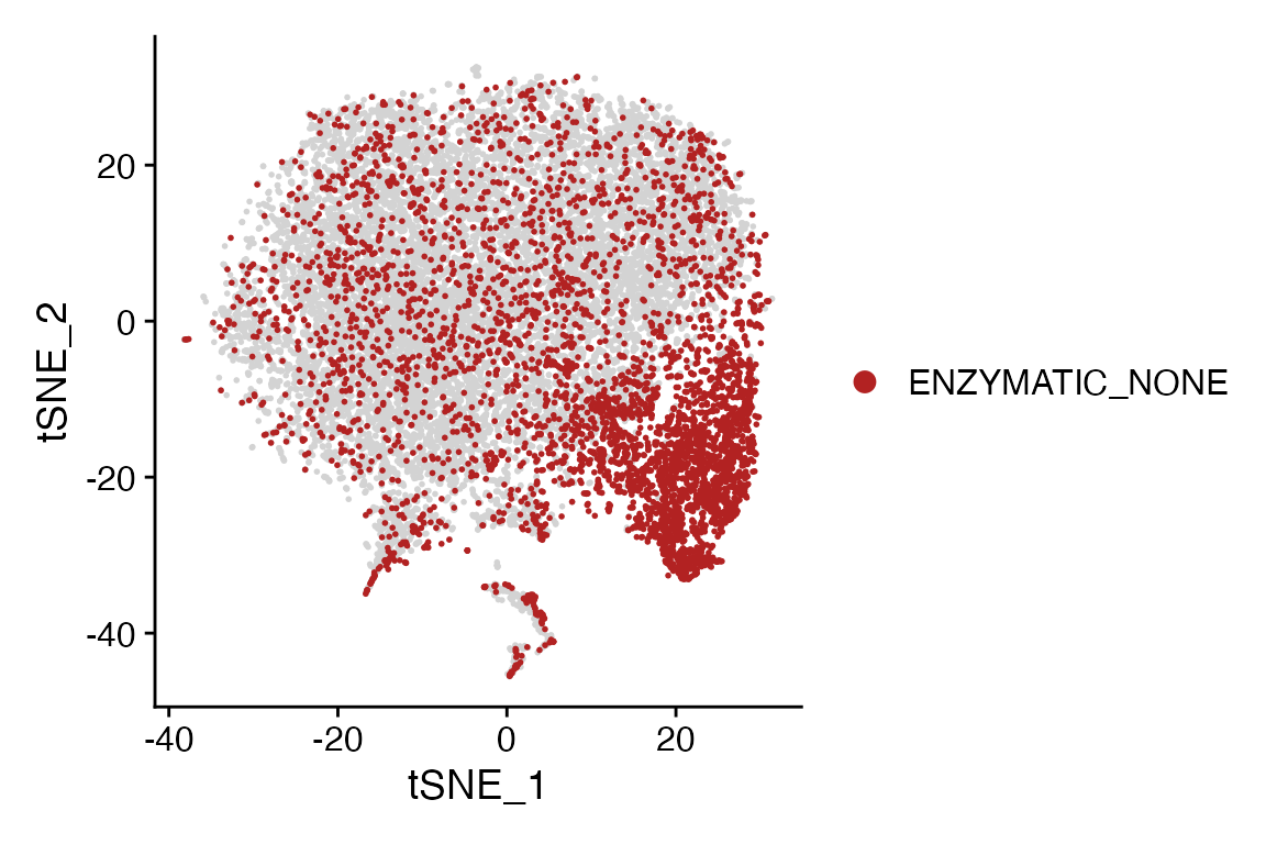
DimPlot_scCustom also sets label = TRUE if
group.by = NULL by default.
Shuffle Points
By default Seurat’s DimPlot() plots each group on top of
the next which can make plots harder to interpret.
DimPlot_scCustom sets shuffle = TRUE by
default as I believe this setting is more often the visualization that
provides the most clarity.
Here is example when plotting by donor in the human dataset to determine how well the dataset integration worked.
DimPlot(object = marsh_human_pm, group.by = "sample_id")
DimPlot_scCustom(seurat_object = marsh_human_pm, group.by = "sample_id")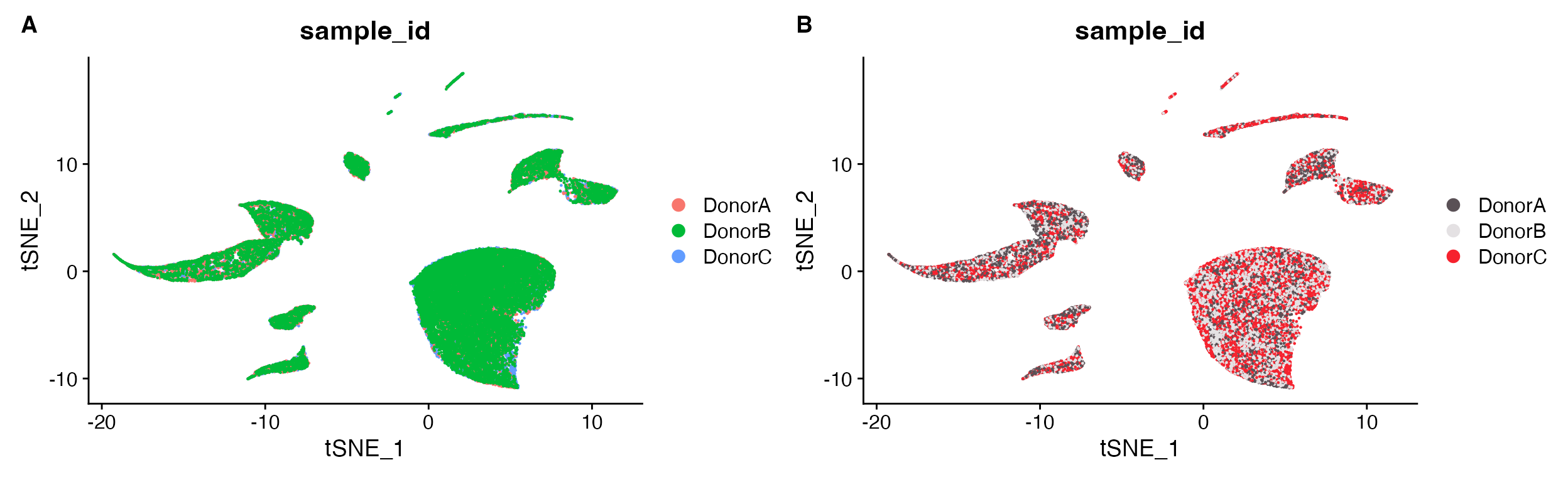
A. Cannot tell how well integrated the samples are
due to plotting one on top of the other. B. Default
plot using scCustomize DimPlot_scCustom.
Split DimPlots
When plotting a split plot Seurat::DimPlot() simplifies
the axes by implementing shared axes depending on the number of columns
specified.
DimPlot(object = pbmc, split.by = "treatment")
DimPlot(object = pbmc, split.by = "sample_id", ncol = 4)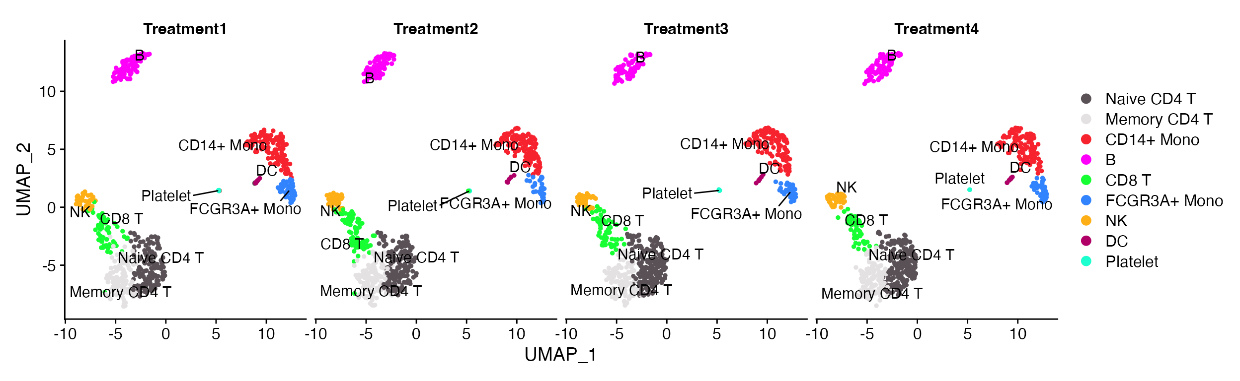
A. The default Seurat split.by looks ok when plots are all present on single row. B. However, the visualization isn’t so good when you starting wrapping plots into multiple rows.
By default when using split.by with
DimPlot_scCustom the layout is returned with an axes for
each plot to make visualization of large numbers of splits easier.
DimPlot_scCustom(seurat_object = pbmc, split.by = "treatment", num_columns = 4, repel = TRUE)
Simplified visualization without having to think about the number of variables that are being plotted.
Can also return to the default Seurat method of splitting plots while
maintaining all of the other modifications in
DimPlot_scCustom by supplying
split_seurat = TRUE
DimPlot_scCustom(seurat_object = pbmc, split.by = "treatment", num_columns = 4, repel = TRUE, split_seurat = TRUE)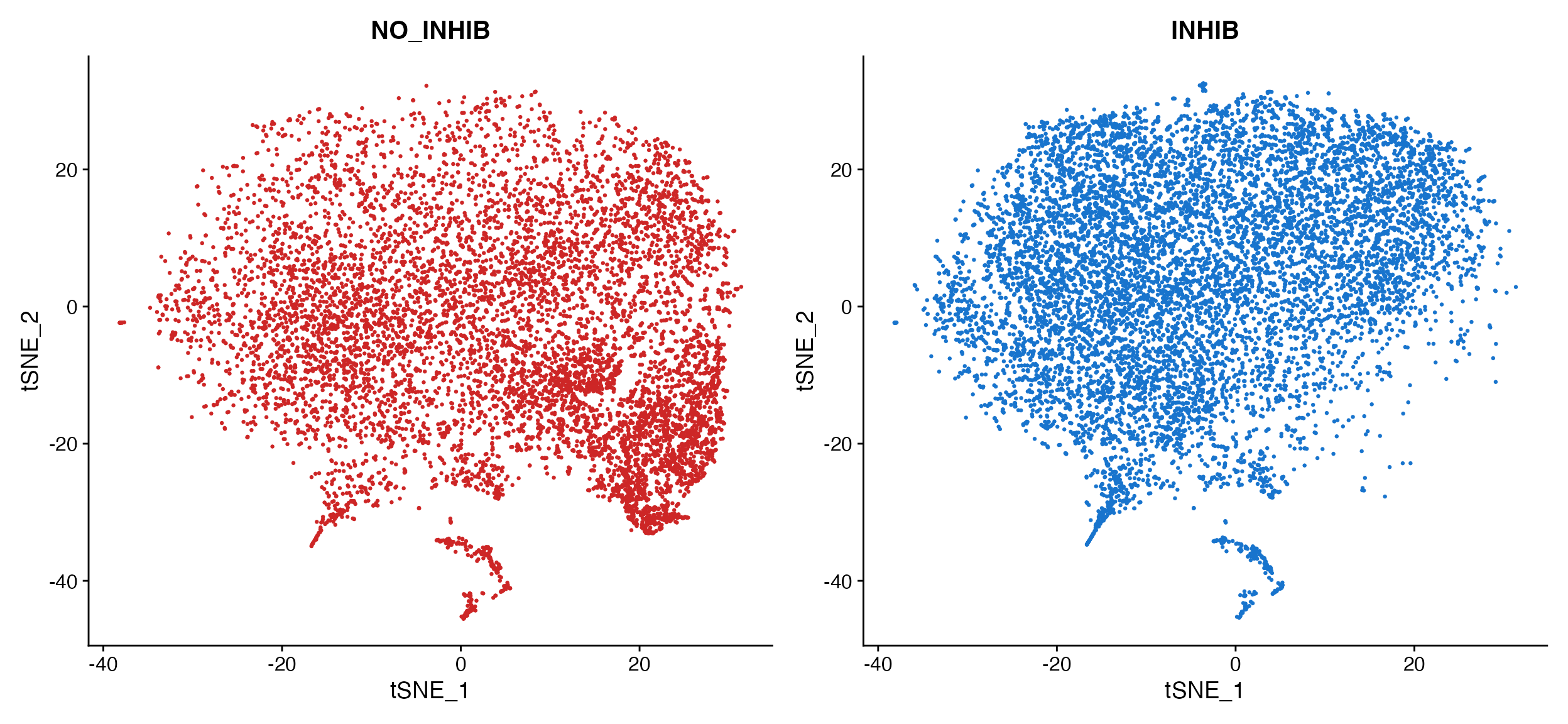
Figure Plotting
Some times when creating plots for figures it is desirable to remove
the axes from the plot and simply add an axis legend. To do this with
DimPlot_scCustom simply set
figure_plot = TRUE.
DimPlot_scCustom(seurat_object = pbmc, figure_plot = TRUE)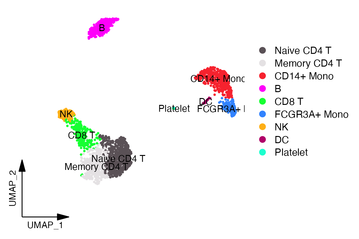
Highlight Cluster(s)
Even with an optimized color palette it can still be difficult to
determine the boundaries of clusters when plotting all clusters at
once.
scCustomize provides easy of use function
Cluster_Highlight_Plot() to highlight a select cluster or
clusters vs. the remainder of cells to determine where they lie on the
plot.
NOTE: While named Cluster_Highlight_Plot this function
will simply pull from seurat_object@active.ident slot which may or may
not be cluster results depending on user settings. For creating
highlight plots of meta data variables see next section on
Meta_Highlight_Plot.
Cluster_Highlight_Plot(seurat_object = marsh_mouse_over, cluster_name = "7", highlight_color = "navy",
    background_color = "lightgray")

Cluster_Highlight_Plot(seurat_object = marsh_mouse_over, cluster_name = "8", highlight_color = "forestgreen",
    background_color = "lightgray")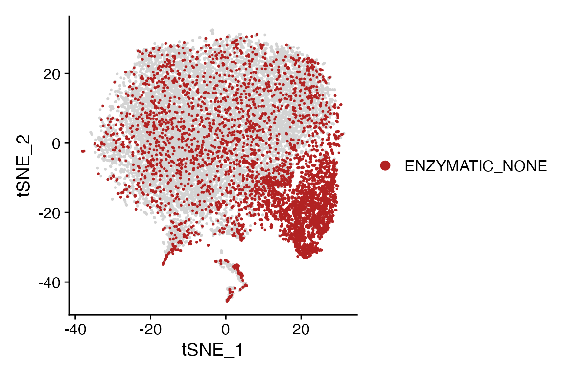
Cluster_Highlight_Plot takes identity or vector of
identities and plots them in front of remaining unselected cells.
Highlight 2+ clusters in the same plot
Cluster_Highlight_Plot() also supports the ability to
plot multiple identities in the same plot.
Cluster_Highlight_Plot(seurat_object = marsh_mouse_over, cluster_name = c("7", "8"), highlight_color = c("navy",
    "forestgreen"))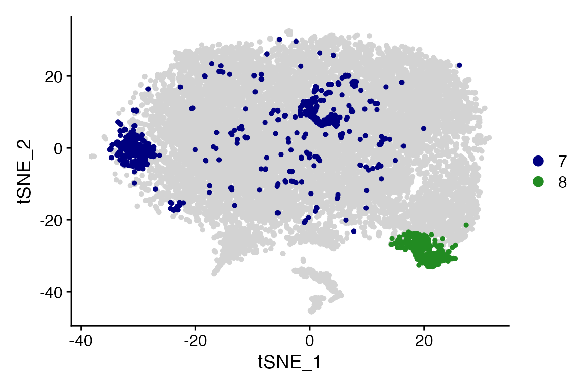
NOTE: If no value is provided to highlight_color
then all clusters provided to cluster_name will be plotted
using single default color (navy).
Highlight Meta Data
scCustomize also contains an analogous function
Meta_Highlight_Plot() that allows for quick highlight plots
of any valid @meta.data variable. Meta data variables must be one of
class(): “factor”, “character”, or “logical” to be highlighted.
Numeric variables representing things like “batch” can be converted
using as.character or as.factor first to allow
for plotting.
Meta_Highlight_Plot(seurat_object = marsh_mouse_micro, meta_data_column = "Transcription_Method",
    meta_data_highlight = "ENZYMATIC_NONE", highlight_color = "firebrick", background_color = "lightgray")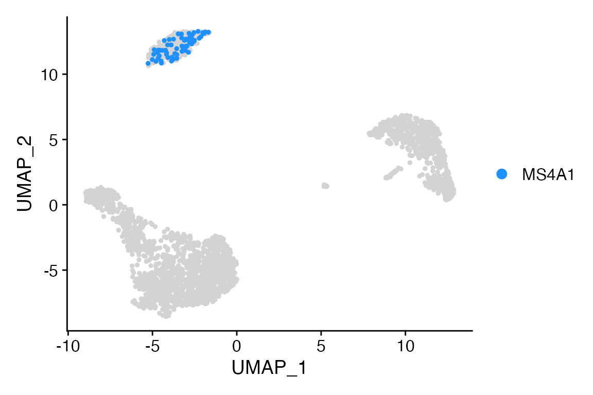
Highlight 2+ factor levels in the same plot
Meta_Highlight_Plot() also supports plotting two or more
levels from the same meta data column in the same plot, similar to
plotting multiple identities with
Cluster_Highlight_Plot()
Meta_Highlight_Plot(seurat_object = marsh_mouse_micro, meta_data_column = "Transcription_Method",
    meta_data_highlight = c("ENZYMATIC_NONE", "DOUNCE_NONE"), highlight_color = c("firebrick", "dodgerblue"),
    background_color = "lightgray")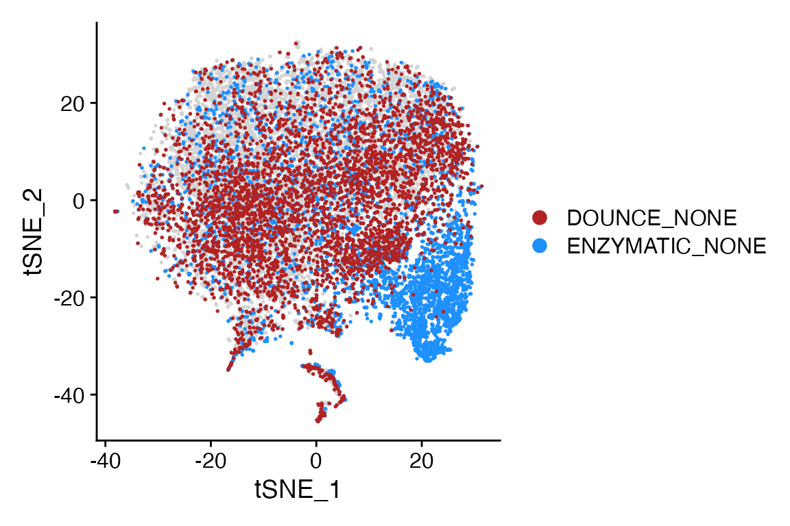
Highlight Cells
Sometimes the cells that you want to highlight on a plot may not be
represented by an active.ident or meta.data column. In this scenario you
can use Cell_Highlight_Plot.
NOTE: Values of cell names provided to
cells_highlight parameter must be a named list.
Let’s say we want to highlight cells with expression of MS4A1 above certain threshold.
# Get cell names
MS4A1 <- WhichCells(object = pbmc, expression = MS4A1 > 3)

# Make into list
cells <- list(MS4A1 = MS4A1)

# Plot
Cell_Highlight_Plot(seurat_object = pbmc, cells_highlight = cells)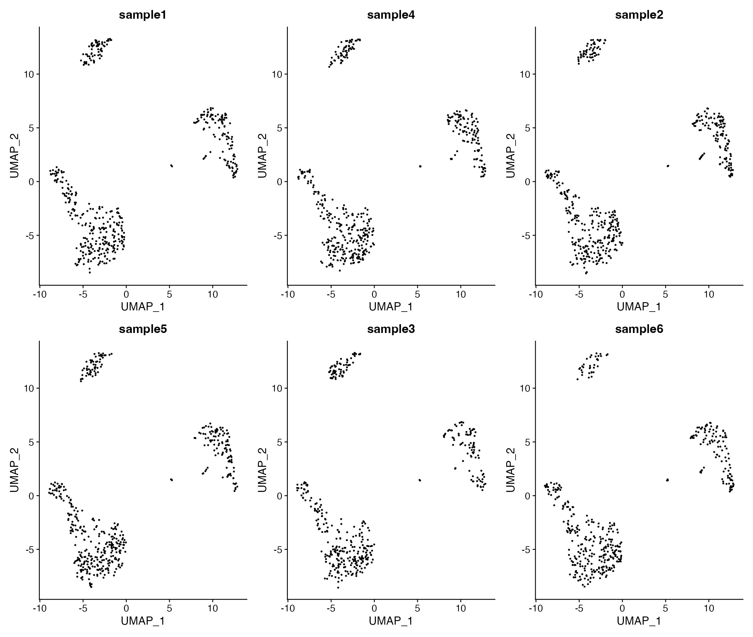
Highlight 2+ sets of cells in the same plot
Cell_Highlight_Plot() also supports plotting two or more
sets of cells in the same plot, similar to plotting multiple identities
with
Cluster_Highlight_Plot()/Meta_Highlight_Plot().
# Get cell names and make list
MS4A1 <- WhichCells(object = pbmc, expression = MS4A1 > 3)
GZMB <- WhichCells(object = pbmc, expression = GZMB > 3)

cells <- list(MS4A1 = MS4A1, GZMB = GZMB)
# Plot
Cell_Highlight_Plot(seurat_object = pbmc, cells_highlight = cells)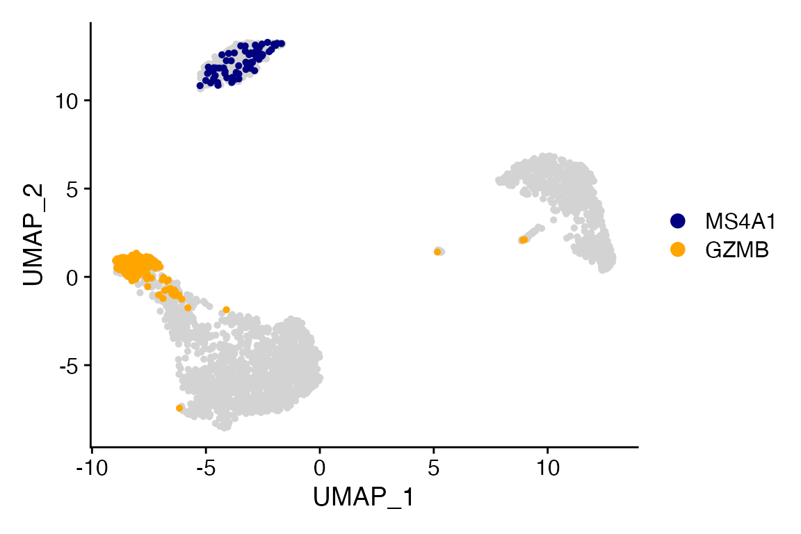
DimPlot Layout Plots
Sometimes can be beneficial to create layouts where there is no grouping variable and plots are simply colored by the split variable.
DimPlot_All_Samples(seurat_object = pbmc, meta_data_column = "sample_id", num_col = 3, pt.size = 0.5)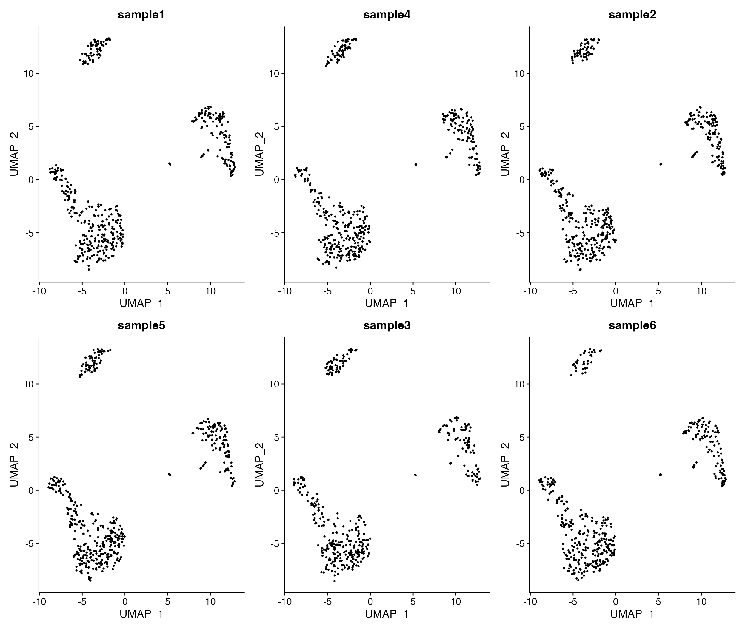
Visualize all samples in simple plot layout.
Can unique color each plot by providing a vector of colors instead of single value
DimPlot_All_Samples(seurat_object = marsh_mouse_micro, meta_data_column = "Transcription", num_col = 2,
    pt.size = 0.5, color = c("firebrick3", "dodgerblue3"))